graph TD
    A["인간의 인지 처리 한계: 밀러의 법칙"] --> B["작업 기억 용량: 3~4개 정보 덩어리 Chunk"]
    B --> C[3초 스캔 규칙 The 3-Second Rule]
    C --> D["시각적 위계: 1.대형 번호 -> 2.3D 비주얼 -> 3.브랜드 로고 -> 4.제품명"]
    D --> E["직관적 인지: 텍스트를 읽기 전에 형태와 색상으로 성격을 파악"]
노트📌 본 가이드의 구성 및 학습 목표
본 문서는 AI 프레젠테이션 & 비교 인포그래픽 제작의 모든 핵심 기법을 한곳에 집대성한 종합 실전 가이드입니다. 총 7가지 세부 테마별 프롬프트 구조와 시각적 문법, 실전 프롬프트 템플릿을 단계별로 학습하실 수 있습니다.
📚 세부 테마 목차
| 파트 | 주제 | 핵심 시각화 대상 |
|---|---|---|
| Part 1 | 애플 키노트 스타일 3단 제품 비교 슬라이드 | 애플 키노트 스타일 3단 제품 비교 슬라이드 |
| Part 2 | AS-IS vs TO-BE 대조 비교 인포그래픽 | AS-IS vs TO-BE 대조 비교 인포그래픽 |
| Part 3 | 하이브리드 5:5 대립 개념 시각화 | 하이브리드 5:5 대립 개념 시각화 |
| Part 4 | 다크 테크 시네마틱 프로세스 인포그래픽 | 다크 테크 시네마틱 프로세스 인포그래픽 |
| Part 5 | 사이버네틱 단면 분해도 인포그래픽 | 사이버네틱 단면 분해도 인포그래픽 |
| Part 6 | 아날로그 페이퍼 전시 보드 인포그래픽 | 아날로그 페이퍼 전시 보드 인포그래픽 |
| Part 7 | 신기술 발표 테크 런칭 원페이지 포스터 | 신기술 발표 테크 런칭 원페이지 포스터 |
Part 1. 애플 키노트 스타일 3단 제품 비교 슬라이드
0. 프레젠테이션 시각 인지 과학: 왜 ’3단 카드 구조’인가?
비즈니스 보고서, 제품 런칭 쇼케이스, 기술 백서(Whitepaper)에서 “여러 제품이나 대안을 비교하는 장표”는 청중의 의사결정을 좌우하는 가장 중요한 핵심 슬라이드입니다. 그러나 많은 발표자가 저지르는 치명적인 실수는 작은 글씨가 빽빽하게 적힌 스프레드시트 표(Table)를 그대로 슬라이드에 붙여넣는 것입니다.
- 밀러의 법칙(Miller’s Law)과 인지 부하: 인간의 단기 작업 기억(Working Memory)은 한 번에 3~4개 이상의 비교군을 만나면 급격한 인지 과부하(Cognitive Overload)를 일으킵니다. 3개의 대상을 독립된 카드로 나란히 배치하는 ‘3단 카드 레이아웃’은 청중이 뇌 에너지를 최소화하면서 각 대안의 본질을 파악할 수 있는 최적의 황금비율입니다.
- 3초 스캔 규칙(The 3-Second Rule): 청중은 슬라이드가 넘어간 뒤 단 3초 이내에 “이 장표가 무엇을 비교하고 있는지”, “각각의 핵심 차별점이 무엇인지”를 시각적으로 인지해야 합니다.
1. 레퍼런스 슬라이드 정밀 역공학 (Reverse Engineering)
애플(Apple)의 글로벌 키노트나 최신 실리콘밸리 테크 런칭 덱에서 볼 수 있는 극상의 미니멀리즘 슬라이드를 분석해 보겠습니다.
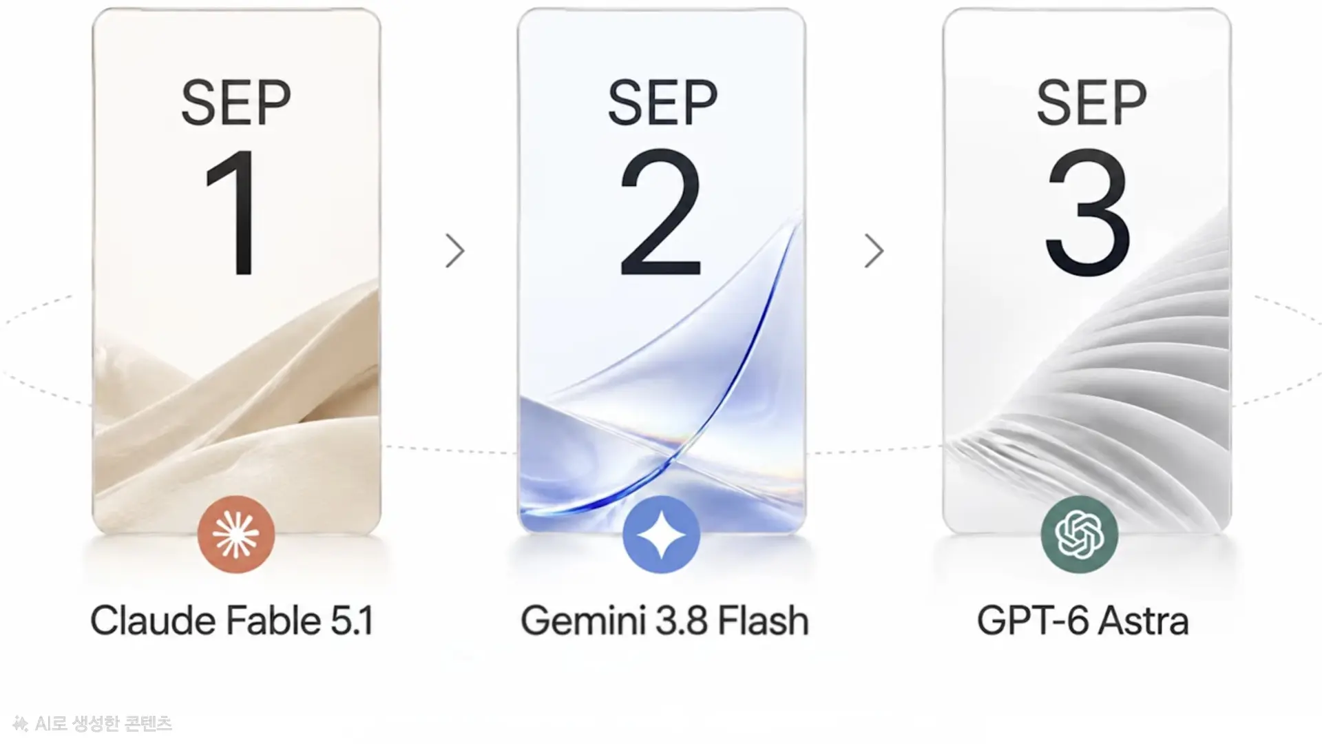
1-1. 시각적 구성 요소 및 레이아웃 해체 분석
위 레퍼런스 이미지는 단순한 그림이 아니라, 고도로 계산된 산업 디자인과 건축적 미학(Architectural Aesthetics)이 적용된 결과물입니다.
classDiagram
    class SlideLayout {
        +AspectRatio: 16:9 Widescreen
        +Background: Clean Studio Warm-White
        +CardCount: 3 Rounded Rectangle Cards
        +Lighting: Soft Diffused Studio Light
    }
    class CardHierarchy {
        +TopLabel: Small Caps "SEP"
        +MainNumber: Big Geometric Sans "1, 2, 3"
        +MiddleVisual: 45% Abstract 3D Material
        +BadgeIcon: Circular Brand Symbol
        +BottomTitle: Precise Sans-Serif Name
    }
    SlideLayout --> CardHierarchy : Contains
- 캔버스 환경:
- \(16:9\) 와이드스크린 비율에 그림자 하나까지 정교하게 제어된 무결점 스튜디오 웜화이트(Warm White) 배경.
- 복잡한 패턴이나 그라데이션을 완전히 배제하여 카드의 비주얼에 시선을 \(100\%\) 집중시킵니다.
- 카드의 종횡비와 표면 질감:
- 세로로 긴 라운드 사각형(약 \(20\text{px}\) 곡률 모서리).
- 투명한 아크릴 또는 젖빛 유리(Frosted Glass) 같은 은은한 반투명 재질감과 미세한 앰비언트 소프트 섀도우(Ambient Shadow).
- 카드 내부의 시각적 위계(Visual Hierarchy):
- 상단: 작은 대문자 식별자(
SEP/TYPE/STEP)와 그 아래 압도적인 크기의 굵은 지오메트릭 산세리프 숫자(1,2,3). - 중앙~하단 (40~50% 영역): 각 대상의 기술적 철학을 상징하는 ‘추상적인 3D 물리 소재(Abstract Material)’ 렌더링.
- 하단 포인트: 브랜드나 개념을 상징하는 정교한 미니 원형 뱃지 아이콘.
- 최하단: 제품의 정확한 명칭(
Claude Fable 5.1,Gemini 3.8 Flash,GPT-6 Astra).
- 상단: 작은 대문자 식별자(
- 연결성과 리듬감:
- 카드 사이의 얇은 회색 셰브론(
>) 기호와 카드를 부드럽게 관통하는 타원형 궤도 점선(Orbital Dotted Line)이 정적인 슬라이드에 미세한 동적 흐름(Dynamic Flow)을 부여합니다.
- 카드 사이의 얇은 회색 셰브론(
2. 브랜드 아이덴티티를 3D 재질 메타포로 변환하는 공식
이 디자인의 핵심은 “설명 글을 쓰는 대신, 물성(Materiality)으로 대상을 느끼게 만드는 것”입니다. 레퍼런스 이미지에서 각 AI 모델이 왜 저러한 3D 형태로 표현되었는지 살펴보면 깊은 메타포가 숨겨져 있습니다.
graph LR
    subgraph Metaphor_Design["브랜드 특성 -> 3D 물리 소재 변환 공식"]
        A["Claude (Anthropic): 따뜻함, 안전성, 인간 친화적 사고"] --> M1["부드럽게 접힌 웜베이지 실크 패브릭 (Warm Silk Fabric)"]
        B["Gemini (Google): 번개 같은 속도, 가벼움, 다재다능함"] --> M2["역동적으로 흐르는 투명 블루 아크릴 글래스 리본 (Translucent Glass Wave)"]
        C["GPT (OpenAI): 체계적 지능, 정밀 엔지니어링, 거대 연산"] --> M3["정밀하게 중첩된 화이트·실버 메탈릭 핀 구조 (Architectural Silver Fins)"]
    end
2-1. 산업 분야별 3D 시각 메타포 추천 매트릭스
자신의 제품이나 서비스를 시각화할 때 아래 매트릭스를 적용하면 프롬프트 작성 시 극적인 차별화를 만들어낼 수 있습니다.
| 제품/서비스 특성 | 추천 색상 팔레트 | 3D 물리 소재 및 표면 질감 | 전달되는 감성적 메시지 |
|---|---|---|---|
| 안정성 / 보안 / 신뢰 | 웜 베이지, 샴페인 골드, 소프트 토프 | 부드러운 드레이프 실크, 캐시미어, 도자기 세라믹 | 흔들리지 않는 편안함, 인간 중심적 기술 |
| 속도 / 경량화 / 민첩성 | 크리스탈 블루, 아이스 시안, 라임 | 유선형 곡선의 투명 아크릴, 반투명 글래스 리본 | 거침없는 유체역학적 속도, 가벼운 성능 |
| 정밀성 / 고성능 / 하드웨어 | 매트 화이트, 티타늄 실버, 건메탈 | 건축학적 레이어드 알루미늄 핀, 기하학적 메탈 큐브 | 극한의 엔지니어링 완성도, 강력한 파워 |
| AI / 알고리즘 / 데이터 | 펄 화이트, 오로라 홀로그램, 에메랄드 | 빛을 굴절시키는 프리즘 크리스탈, 격자형 네트워크 | 무한한 확장성, 지능적인 데이터 연산 |
| 친환경 / 바이오 / 헬스케어 | 세이지 그린, 포레스트, 에코 화이트 | 유기적으로 굽이치는 나뭇잎 곡면, 생분해성 바이오 소재 | 지속 가능성, 생명력, 자연과의 조화 |
3. 마스터 프롬프트 생성기: AI에게 프롬프트 작성을 지시하는 메타 템플릿
ChatGPT, Claude, Gemini 등의 LLM에게 비교할 대상 3개의 정보만 던져주면, 미드저니/FLUX용 완벽한 영문 이미지 생성 프롬프트를 자동으로 뽑아내도록 설계된 전문 시스템 프롬프트입니다.
이 프롬프트를 복사하여 AI 채팅창에 입력한 뒤 사용해 보세요.
당신은 최고급 프레젠테이션 슬라이드 전문 아트디렉터이자 이미지 생성 프롬프트 엔지니어입니다.
아래 제공되는 3개의 제품·서비스·기술 정보를 분석하여, Apple Keynote 수준의 프리미엄 테크 16:9 슬라이드 이미지를 생성할 수 있는 완벽한 [최종 영문 이미지 생성 프롬프트 1개]를 작성하세요.

[디자인 원칙]
1. 화면비: 16:9 가로형 와이드스크린, 무결점 웜화이트 스튜디오 배경, 부드러운 스튜디오 디퓨즈 라이팅.
2. 레이아웃: 화면 중앙에 동일한 크기의 세로형 라운드 사각형(Glassmorphic Card) 3장 좌우 대칭 배치.
3. 카드 위계:
   - 상단: 작은 영문 식별 라벨 (예: STEP / TYPE / OPTION)
   - 상단 중앙: 매우 크고 굵은 지오메트릭 산세리프 숫자 (1, 2, 3)
   - 중앙~하단 (45%): 대상의 성격을 상징하는 고급 3D 추상 소재 (Fabric, Glass, Metal, Crystal 등 차별화)
   - 하단: 원형 미니 뱃지 심볼 아이콘
   - 최하단: 대상의 정확한 명칭
4. 대상 간 관계: 순차 발전/우열이 있다면 카드 사이에 얇은 회색 '>' 배치, 동등 비교라면 간격만 유지.
5. 금지: 지저분한 텍스트 단락, 복잡한 배경, 만화풍, 저화질 스톡 사진, 강한 네온 조명 배제.

[비교할 대상 입력]
- 대상 1: [제품명 / 핵심 특성 및 강점]
- 대상 2: [제품명 / 핵심 특성 및 강점]
- 대상 3: [제품명 / 핵심 특성 및 강점]
- 비교 목적 및 분위기: [예: AI 모델 성능 비교 / 미니멀 프리미엄]

위 정보를 바탕으로 Midjourney v6 또는 FLUX.1에 그대로 복사해 넣을 수 있는 '하나의 완성형 영문 프롬프트'만 출력하세요.
4. 즉시 복사해서 사용하는 실전 이미지 생성 프롬프트 3종
Midjourney(미드저니 v6.1), FLUX.1, 또는 DALL-E 3에 바로 복사하여 최고 품질의 16:9 비교 슬라이드를 뽑아낼 수 있는 검증된 실전 프롬프트입니다.
4-1. [케이스 1] 차세대 3대 거대 AI 모델 비교 슬라이드 (레퍼런스 완벽 재현)
A premium Apple keynote presentation slide in 16:9 aspect ratio, ultra-clean and minimal tech aesthetic. A seamless studio warm-white background with soft ambient lighting and balanced negative space. Three identical vertical rounded-rectangle cards aligned horizontally across the center.

Left Card 1: Crisp sans-serif text "SEP" at the top, a giant bold geometric number "1" below it. The bottom half features an elegant 3D abstract folded silk fabric in warm champagne beige tones. Below the card, a circular orange emblem and clean modern typography "Claude 3.5 Sonnet".

Center Card 2: Crisp text "SEP" and a giant bold number "2". The bottom half features a flowing dynamic ribbon of translucent blue curved acrylic glass. Below the card, a circular royal blue sparkle icon and clean typography "Gemini 1.5 Pro".

Right Card 3: Crisp text "SEP" and a giant bold number "3". The bottom half features architectural layered white-silver metallic fan fins with precision edges. Below the card, a circular teal emblem and clean typography "GPT-4o".

Subtle thin light-gray chevron arrows ">" placed between the cards with a delicate curved dotted trajectory line across the slide. High-end industrial design, photorealistic material rendering, 8k resolution, crisp vector-like typography, presentation ready --ar 16:9 --style raw --v 6.1
4-2. [케이스 2] 글로벌 3대 클라우드 인프라 비교 (AWS vs Azure vs GCP)
A sophisticated technology comparison presentation slide in 16:9 ratio, minimal Scandinavian design aesthetic, ultra-clean off-white background with soft studio floor shadows. Three tall vertical glassmorphic cards neatly aligned side by side with generous whitespace.

First Card (AWS): Giant bold number "01" at top. Inside the lower half, an intricate 3D modular golden-orange architectural cube structure representing massive enterprise cloud scale. Circular orange badge and sharp title "Amazon Web Services" at bottom.

Second Card (Azure): Giant bold number "02" at top. Inside the lower half, layered geometric deep-blue translucent frosted glass prisms representing corporate hybrid enterprise systems. Circular blue badge and sharp title "Microsoft Azure" at bottom.

Third Card (Google Cloud): Giant bold number "03" at top. Inside the lower half, a floating multi-color organic glass sphere with refractive optical physics representing advanced AI and big data analytics. Circular multi-color badge and sharp title "Google Cloud Platform" at bottom.

Equal spacing between cards, subtle vertical hairline dividers, premium keynote deck quality, precision typography, zero clutter, 4K render --ar 16:9 --v 6.1
4-3. [케이스 3] 차세대 올인원 생산성 도구 비교 (Notion vs Obsidian vs Linear)
A modern software product launch slide, 16:9 widescreen, pure minimalist aesthetic on a matte ivory background. Three elegant vertical rounded cards displayed symmetrically in the middle.

Card A (Notion): Bold numeral "1" at top. The lower section contains an abstract minimalist composition of interlocking matte black and paper-white architectural blocks symbolizing modular workspaces. Minimalist icon badge and sleek title "Notion Workspace".

Card B (Obsidian): Bold numeral "2" at top. The lower section contains an intricate 3D glowing crystalline neural graph network with fine interconnected lines representing local knowledge graphs. Deep purple-tinted crystal sphere icon and sleek title "Obsidian Vault".

Card C (Linear): Bold numeral "3" at top. The lower section contains razor-sharp metallic aerodynamic blades with precision speed lines in graphite gray, symbolizing ultra-fast issue tracking. Circular dark-indigo emblem and sleek title "Linear Sync".

Subtle soft shadows beneath the cards, crisp modern typography, Apple design award aesthetic, perfectly aligned grid, 8k commercial presentation quality --ar 16:9 --style raw --v 6.1
5. 생성 후 200% 완성도를 높이는 실무 후가공 팁
생성형 AI로 슬라이드 배경 이미지를 훌륭하게 뽑아냈다면, 실제 발표 현장에서 가독성을 극대화하기 위해 다음과 같은 간단한 그래픽 리터칭(Figma, Canva, PowerPoint 활용)을 병행하는 것이 프로의 작업 방식입니다.
flowchart TD
    Gen["(1) AI 이미지 생성: Midjourney / FLUX로 16:9 무결점 렌더링"] --> Check{텍스트 품질 확인}

    Check -->|글자가 완벽하게 생성됨| Ready[즉시 프레젠테이션 장표로 사용]
    Check -->|글자 스펠링이 뭉개지거나 오타 발생| Edit[2. 그래픽 도구로 후가공 보정]

    Edit --> StepA["포토피아/포토샵 AI 생성 채우기로 텍스트 영역만 깨끗이 지우기"]
    Edit --> StepB[Figma or PPT에서 'Pretendard' 또는 'Inter' 폰트로 정밀 텍스트 오버레이]
    StepB --> Final[발표용 고해상도 최종 슬라이드 완성]
- 텍스트가 뭉개질 때의 해결책 (Text Replacement):
- 이미지 생성 AI는 간혹 영문 스펠링을 임의로 왜곡하거나 오타를 낼 수 있습니다.
- 이때 당황하지 말고, 프롬프트에서 텍스트 부분을 아예 빼고 렌더링하거나, 생성된 이미지의 하단 텍스트 영역을 Photopea나 포토샵의 ‘내용 인식 채우기(Content-Aware Fill)’로 지운 뒤, PPT나 Figma에서 Pretendard, Inter, SF Pro 같은 현대적인 볼드 산세리프 폰트로 텍스트를 직접 얹으면 완벽한 고해상도 결과물이 완성됩니다.
- 반응형 웹 블로그 삽입 시 팁:
- 블로그 포스트 본문에 삽입할 때는
100%너비와 함께 적절한fig-cap캡션을 부여하여 모바일 화면에서도 카드의 3단 정렬이 시각적으로 명확히 전달되도록 유도합니다.
- 블로그 포스트 본문에 삽입할 때는
결론: 텍스트의 나열을 넘어선 시각적 스토리텔링
청중의 기억에 남는 발표는 복잡한 표를 읽게 만드는 프레젠테이션이 아니라, “단 한 장의 카드로 각 대상의 정체성을 뇌리에 각인시키는 프레젠테이션”입니다.
오늘 소개해 드린 3단 카드 시각 위계 프레임워크와 3D 물리 소재 메타포 공식, 그리고 실전 프롬프트를 활용하여, 다음 발표와 기획서에서 애플 키노트 부럽지 않은 최고급 비주얼을 손쉽게 완성해 보시기 바랍니다.
Part 2. AS-IS vs TO-BE 대조 비교 인포그래픽
0. 제안서의 승패를 가르는 ‘극적인 시각적 전후(Before & After)’ 대조
경영진 보고, 정부 과제 제안서, 스타트업 투자 유치 IR 덱에서 심사위원의 마음을 움직이는 가장 결정적인 장표는 “도입 전(AS-IS)의 고통과 문제점”과 “도입 후(TO-BE)의 눈부신 혁신과 가치”를 비교하는 슬라이드입니다. 글자로만 적힌 표는 감정적 변화를 이끌어내지 못하지만, 시각적 은유가 가미된 3D AS-IS / TO-BE 인포그래픽은 단 3초 만에 사업의 필요성을 납득시킵니다.
graph LR
    subgraph AS_IS [좌측: AS-IS 레거시 현황]
        A1["수작업 서류 더미 & 분절된 사일로"]
        A2[붉은 경고등, 얽힌 배선, 칙칙한 회색 톤]
        A3[비효율과 병목 현상의 시각화]
    end
    subgraph Transition [중앙: 디지털 전환 브릿지]
        T["전환 화살표 & AI 지능형 코어 도입"]
    end
    subgraph TO_BE [우측: TO-BE 혁신 청사진]
        B1["클라우드 통합 대시보드 & 자동화 파이프라인"]
        B2["청량한 에메랄드/블루, 정돈된 모듈, 밝은 햇살"]
        B3[비용 절감과 초격차 생산성 달성]
    end
    AS_IS --> Transition --> TO_BE
- 극적인 채도와 조명의 대비: 좌측 AS-IS는 어둡고 탁한 콘크리트 그레이와 붉은색 경고등으로 답답함을 연출하고, 우측 TO-BE는 화사한 웜화이트와 싱그러운 에메랄드/블루로 해방감을 줍니다.
- 공간 정돈(Spatial Order)의 메타포: 어지럽게 널브러진 서류와 꼬인 전선이 우측에서는 깔끔한 유리 선반과 발광 파이프라인으로 매끄럽게 정렬됩니다.
1. 레퍼런스 비주얼 정밀 분석 (Deconstruction)
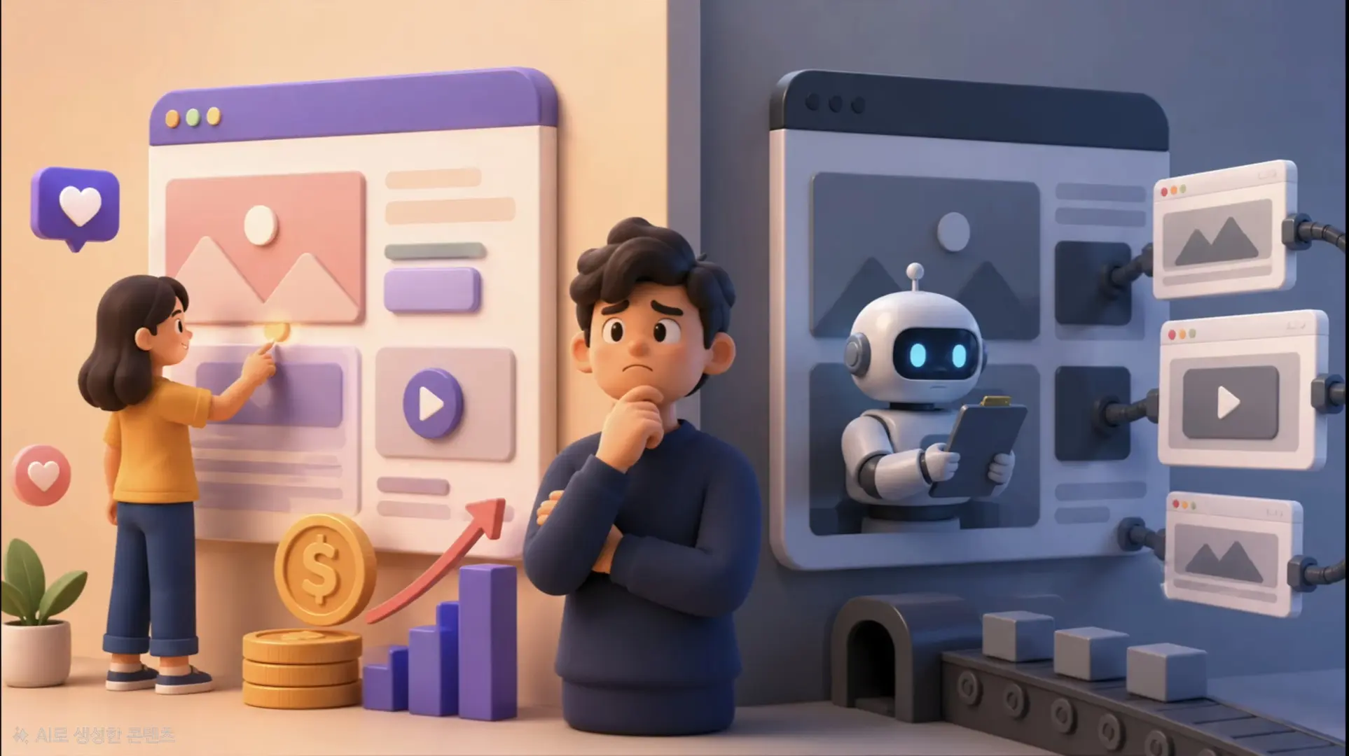
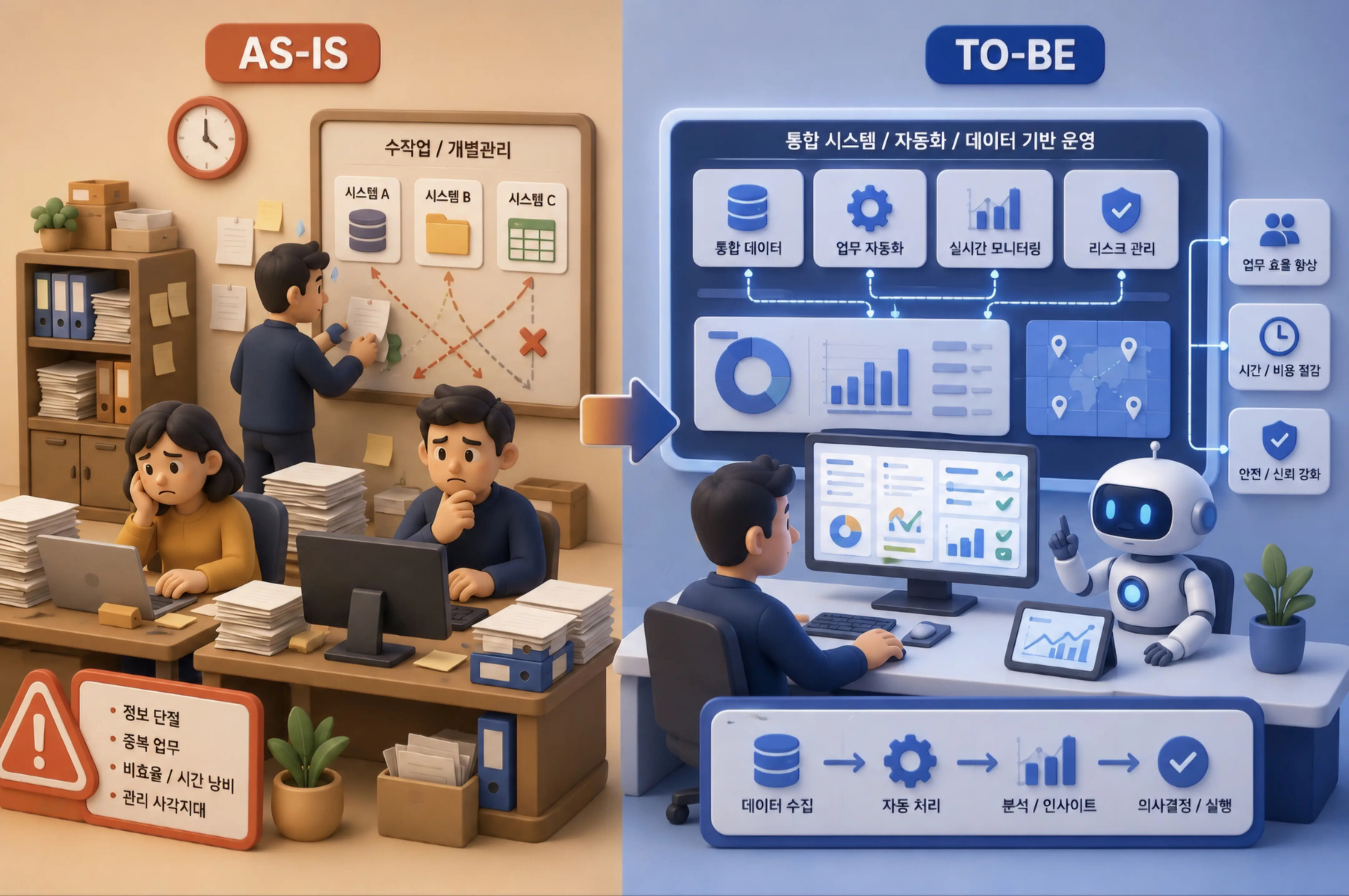
1-1. 16:9 화면 분할 구도 및 인지 법칙
classDiagram
    class AsIsToBeComposition {
        +AspectRatio: 16:9 Widescreen Landscape
        +Divider: Subtle glowing vertical boundary line or curved trajectory arrow
        +Left_AsIs: 45% Width / Cluttered, desaturated, red warning alerts, manual bottleneck
        +Center_Bridge: 10% Width / Dynamic transition arrow or digital portal
        +Right_ToBe: 45% Width / Pristine ivory, glowing cyan pipelines, modular glass dashboards
    }
- 좌측 (AS-IS): 고통의 가시화:
- 채도가 빠진 차콜 그레이 톤.
- 무질서하게 쌓인 종이 서류, 수동 도장, 분절된 낡은 서버 타워, 스파게티처럼 얽힌 전선.
- 중앙 (The Transformation Pivot):
- 좌측에서 우측으로 에너지가 흐르는 우아한 3D 네온 화살표 또는 디지털 게이트웨이.
- 우측 (TO-BE): 이상의 실현:
- 완벽하게 정렬된 클라우드 글래스모피즘 모듈, 투명한 태블릿 인터페이스, 한 번의 클릭으로 완료되는 자동화 승인 루프.
2. 핵심 프롬프트 파라미터 및 키워드 사전
| 비교 축 | AS-IS 필수 키워드 | TO-BE 필수 키워드 |
|---|---|---|
| 분위기 & 톤 | cluttered, messy, desaturated gray tone, gloomy dim lighting |
pristine, organized, bright luminous lighting, vibrant cyan accents |
| 물리적 상태 | overflowing paper documents, tangled cables, fragmented silos |
streamlined glassmorphic UI, glowing modular pipelines, automated flow |
| 감정적 신호 | inefficiency, bottleneck, red warning indicators |
effortless efficiency, real-time intelligence, emerald green success |
| 전체 구도 | 16:9 split-screen comparison infographic, left AS-IS versus right TO-BE |
dramatic side-by-side juxtaposition, transformation arrow |
3. 마스터 메타 프롬프트 템플릿
당신은 맥킨지/BCG 수준의 글로벌 전략 컨설팅 펌 프레젠테이션 수석 비주얼 디렉터입니다.
아래 [혁신 과제]를 바탕으로, Midjourney v6.1에 입력할 완벽한 [AS-IS vs TO-BE 3D 비교 인포그래픽 영문 프롬프트 1개]를 작성하세요.

[필수 요건]
1. 화면비: 16:9 와이드스크린, 좌우 5:5 완벽한 대비 구도.
2. 좌측(AS-IS): 수작업, 단절, 얽힌 케이블, 칙칙한 조명, 빨간 경고 신호로 문제점 극대화.
3. 우측(TO-BE): 클라우드, 통합 자동화, 정돈된 모듈, 밝은 스튜디오 조명, 청록색 발광 라인으로 혁신 극대화.
4. 중앙 연결: 좌에서 우로 자연스럽게 흐르는 3D 전환 벡터 흐름.

[혁신 과제]: {여기에 개선할 비즈니스, 행정, 데이터 시스템 주제를 적으세요}
4. 즉시 복사 가능한 실전 생성 프롬프트 2종
4-1. [케이스 1] 공공 행정 문서 결재의 디지털 혁신 (레퍼런스 완벽 재현)
A stunning 16:9 split-screen 3D comparison infographic illustrating Digital Transformation from AS-IS to TO-BE. LEFT HALF (AS-IS): A dimly lit, cluttered office space with overflowing paper binders, manual red rubber stamps, tangled black wires, and sluggish hourglass icons in desaturated gray tones. RIGHT HALF (TO-BE): A sunlit, pristine enterprise tech environment featuring sleek floating glassmorphic tablet dashboards, automated green checkmarks, and glowing cyan data pipelines seamlessly connecting modules. A dynamic, luminous 3D transformation arrow flows from left to right across the center seam. Hyper-detailed claymorphism aesthetic, studio depth of field, presentation ready --ar 16:9 --style raw --v 6.14-2. [케이스 2] 제조업 스마트 팩토리 품질 검사 공정의 진화
A powerful side-by-side 3D technological comparison poster. LEFT: Traditional factory floor showing weary workers manually inspecting parts with calipers under harsh yellow sodium lights, defect boxes piling up in chaotic shadows. RIGHT: Fully automated smart factory line where high-speed AI robotic cameras scan products with precision laser light sheets, defect-free green indicators, and real-time cloud telemetry. Studio-grade octane render, crisp negative space, stark contrast of old legacy vs intelligent future --ar 16:9 --v 6.15. 실무 발표 및 보고서 배치 팁
- ’Before’에 시선이 오래 머물지 않게 연출:
- 인간의 시선은 본능적으로 밝고 채도가 높은 곳으로 향합니다. 좌측 AS-IS의 명도를 의도적으로 낮추고 우측 TO-BE의 광량을 높이면, 청중은 자연스럽게 회사가 나아갈 미래 청사진에 압도적인 긍정적 확신을 갖게 됩니다.
- 정량적 수치 뱃지 결합:
- 우측 TO-BE 상단 여백에 “처리 시간 85% 단축”, “비용 40% 절감”과 같은 정량적 성과 지표(ROI)를 큰 글씨로 얹으면 제안서의 설득력이 정점에 달합니다.
Part 3. 하이브리드 5:5 대립 개념 시각화
0. 왜 대립 개념의 융합인가? 비주얼 변증법(Visual Dialectics)
철학과 인지과학에서 상반되는 두 명제를 충돌시켜 새로운 통찰을 얻는 과정을 ’정반합(正反合) 변증법’이라고 부릅니다. 디자인에서도 마찬가지입니다. 단순한 하나의 개념을 설명하는 것보다, “극단적으로 대조되는 두 개념을 하나의 동일한 외형적 실루엣 안에 절반씩 담아내는 기법”은 관람자의 뇌리에 지워지지 않는 강렬한 인상을 남깁니다.
graph TD
    A["단일 사물의 외형 실루엣: 예: 인간의 뇌 / 커피잔 / 지구"] --> B[수직 정중앙 분할선 Vertical Axis]
    B --> C["좌측 Left: 논리적·기계적·사이버네틱스 블루"]
    B --> D["우측 Right: 감성적·유기적·자연생태 웜톤"]
    C & D --> E["하이브리드 이분법: 두 세계관의 완벽한 융합과 대비"]
- 인지적 불협화음과 몰입: 관람자는 좌측의 기계적 정밀함과 우측의 생명력 넘치는 유기적 요소가 하나의 몸체로 이어져 있는 모습을 보며 깊은 호기심과 지적 자극을 느낍니다.
- 비즈니스 은유(Metaphor)의 최적화: ‘기술과 인간미의 결합’, ‘AI와 창의성의 융합’, ‘데이터 분석과 직관의 조화’ 등 복잡한 기업 철학을 단 한 컷의 그래픽으로 완벽히 대변할 수 있습니다.
1. 레퍼런스 비주얼 정밀 역공학 (Deconstruction)
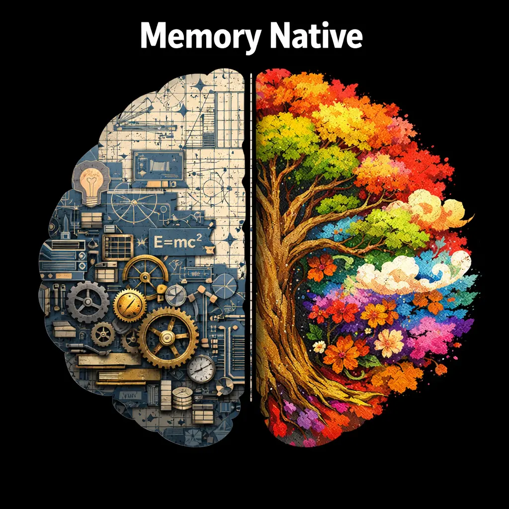
1-1. 시각적 구성 요소 및 스타일 해체 분석
classDiagram
    class DichotomyStructure {
        +Symmetry: Perfect 5:5 Vertical Split
        +LeftHemisphere: Technical, Mechanical, PCB Circuit, Neon Blue
        +RightHemisphere: Organic, Botanical, Blooming Flowers, Warm Sunlight
        +ConnectionBridge: Seamlessly fused spine and shared contour
        +Background: Neutral Split or Solid Muted Studio Floor
    }
- 외곽선 일치(Unified Silhouette):
- 좌우가 서로 다른 재질과 색상을 띠고 있지만, 전체적인 외곽 실루엣은 완벽하게 하나의 통일된 형태(예: 완벽한 하트, 두개골, 과일, 카메라 등)를 유지해야 합니다.
- 좌측 반구 (The Analytical Half):
- 기계 부품, 반투명 회로 기판(PCB), 발광 광섬유, 티타늄 기어, 쿨톤 블루/시안 네온 조명.
- 질감: 매트 메탈릭, 폴리카보네이트, 정밀 레이저 에칭.
- 우측 반구 (The Organic Half):
- 활짝 핀 꽃, 굽이치는 덩굴, 부드러운 이끼, 날아다니는 나비, 따뜻한 햇살(Golden hour ray).
- 질감: 생생한 식물 엽록소 잎맥, 이슬 맺힌 꽃잎, 테라코타 점토.
- 결합 경계선(The Fused Seam):
- 칼로 자른 듯한 밋밋한 분할선이 아니라, 기계 배선 사이로 식물 뿌리가 파고들거나 금속 플레이트 틈새로 꽃이 피어나는 식의 ’유기적 침투’가 일어날 때 최고 완성도가 구현됩니다.
2. 핵심 프롬프트 파라미터 및 키워드 사전
| 속성 분류 | 필수 영문 프롬프트 키워드 | 비주얼 효과 |
|---|---|---|
| 구도 및 대칭 | hybrid dichotomy illustration, vertical split 50/50, symmetrical dual-nature |
정확히 정중앙을 기준으로 분할된 이분법 구도 |
| 기계/기술 측면 | cybernetic mechanical interior, glowing circuit boards, exposed robotic hydraulics |
내부가 들여다보이는 정밀 하드웨어 공학 디테일 |
| 자연/유기 측면 | flourishing botanical garden, blooming flora and fauna, moss and organic vines |
생명력이 약동하는 풍성한 식물학적 디테일 |
| 조명 및 렌더 | dual lighting setup, cool cyan versus warm golden amber, hyper-detailed studio render |
좌우의 상반된 색온도가 맞부딪히는 시네마틱 조명 |
3. 마스터 JSON 메타 프롬프트 템플릿
{
  "style": "Hybrid Dichotomy Concept Art, Dual-Nature Metaphor",
  "subject": {
    "outer_form": "[통일된 메인 피사체 형태: 예: human heart / lightbulb / camera]",
    "split_axis": "Exact vertical 50/50 split down the center axis"
  },
  "left_side": {
    "theme": "High-tech / Artificial / Logic",
    "materials": "Titanium alloy, matte dark carbon, glowing microcircuits, exposed gears",
    "color_palette": "Electric blue, cool cyan, silver, graphite gray",
    "lighting": "Sharp directional cold LED rim light"
  },
  "right_side": {
    "theme": "Nature / Organic / Emotion",
    "materials": "Lush moss, blooming wild orchids, twisted tree bark, morning dewdrops",
    "color_palette": "Earthy sage green, floral pink, radiant amber gold",
    "lighting": "Soft warm volumetric sunlight with gentle god-rays"
  },
  "rendering_details": {
    "background": "Solid neutral studio gray (#E0E0E0) with subtle ambient floor shadow",
    "quality": "Hyper-realistic textures, clean vector-like precision silhouette, 8k resolution"
  }
}
4. 즉시 복사 가능한 실전 생성 프롬프트 3종
4-1. [케이스 1] 인공지능과 인간 두뇌의 이분법 (AI Chip vs Human Brain)
A stunning conceptual hybrid dichotomy illustration of a human brain, split perfectly 50/50 vertically down the center. The LEFT HALF is made of intricate cybernetic hardware, illuminated neon-blue circuit tracks, translucent microchips, and exposed gold pins. The RIGHT HALF is an organic, flourishing miniature rainforest ecosystem bursting with colorful exotic flowers, delicate green vines, moss, and tiny fluttering butterflies. The two halves merge seamlessly at the center seam with roots entwining through circuit boards. Clean studio neutral background with soft floor shadow, cinematic dual-color lighting (cool blue vs warm sunlit amber), hyper-detailed, 8k commercial masterpiece --ar 16:9 --style raw --v 6.14-2. [케이스 2] 아날로그 필름과 디지털 센서 카메라의 공존
A poetic hybrid dichotomy product visualization of a vintage Leica-style camera split vertically in half. The left half is crafted from classic aged brass, mechanical dials, exposed winding gears, and textured leatherette. The right half transforms into an ultra-modern transparent futuristic camera housing with floating holographic optics, digital matrix sensors, and glowing violet laser beams. Studio product photography on a matte ivory pedestal, razor-sharp focus, beautiful juxtaposition of past and future technology --ar 4:3 --v 6.14-3. [케이스 3] 친환경 클린에너지 vs 전통 화석연료 발전소
A powerful conceptual artwork of a colossal industrial lightbulb divided vertically into two contrasting worlds. The left hemisphere depicts smoky smokestacks, dark industrial steel scaffolding, and oil pipelines under a stormy dramatic twilight sky. The right hemisphere reveals an idyllic green sanctuary inside the glass, featuring miniature spinning wind turbines, crystalline solar panels, emerald meadows, and cascading pristine waterfalls under a brilliant sunlit sky. Masterful environmental storytelling, photorealistic octane render, 8k --ar 16:9 --v 6.15. 실무 후가공 및 프레젠테이션 활용 팁
- 키노트 대조 슬라이드 배경:
- 이 이미지는 ‘문제점(Pain Point) vs 해결책(Solution)’ 또는 ’레거시(Legacy) vs 차세대(Next-Gen)’를 발표할 때 슬라이드의 정중앙에 배치하고, 좌우에 각각 텍스트 요점을 불릿 포인트로 배치하면 청중이 3초 만에 맥락을 이해합니다.
- 컬러 그레이딩 일관성 유지:
- 생성된 이미지의 좌우 대비가 너무 과도하여 슬라이드 전체 톤을 해칠 경우, 포토샵에서
Selective Color또는Color Lookup레이어를 얹어 전체적인 채도를 15% 정도 낮추면 훨씬 정돈된 기업용 보고서 비주얼을 만들 수 있습니다.
- 생성된 이미지의 좌우 대비가 너무 과도하여 슬라이드 전체 톤을 해칠 경우, 포토샵에서
Part 4. 다크 테크 시네마틱 프로세스 인포그래픽
0. 과학과 예술의 만남: 시네마틱 과학 해설(Scientific Explainer)
기후 변화 시뮬레이션, 양자 컴퓨터 연산 파이프라인, 위성 재난 관제 시스템 등 고도로 복잡한 과학 기술 데이터를 대중과 의사결정자에게 전달하는 것은 대단히 어렵습니다. 이때 헐리우드 SF 영화의 관제 센터나 내셔널지오그래픽 다큐멘터리에서 사용하는 ‘프리미엄 다크 테크 프로세스 인포그래픽’은 시각적 경외감을 불러일으킵니다.
graph LR
    A["원시 환경 데이터 / 위성 센서"] -->|좌측 Step 1: 관측 및 수집| B["AI 분석 허브: 시뮬레이션 모델링"]
    B -->|중앙 Step 2: 예측 및 머신러닝| C[위험 탐지 및 자동 대응]
    C -->|우측 Step 3: 실시간 방재 및 결과 출력| D["완벽한 좌->우 파이프라인 완성"]
- 다크 모드의 압도적 명암비: 칠흑 같은 미드나잇 블루 배경 위에 데이터 경로를 네온 시안과 마젠타로 발광시켜, 빛나는 노드에 관람자의 시선을 100% 가둡니다.
- 좌에서 우로 흐르는 서사적 위계(Left-to-Right Narrative): 인간의 독서 방향에 맞춰 ’입력 \(\rightarrow\) 처리 \(\rightarrow\) 결과’가 물 흐르듯 자연스럽게 인지됩니다.
1. 레퍼런스 비주얼 정밀 역공학 (Deconstruction)
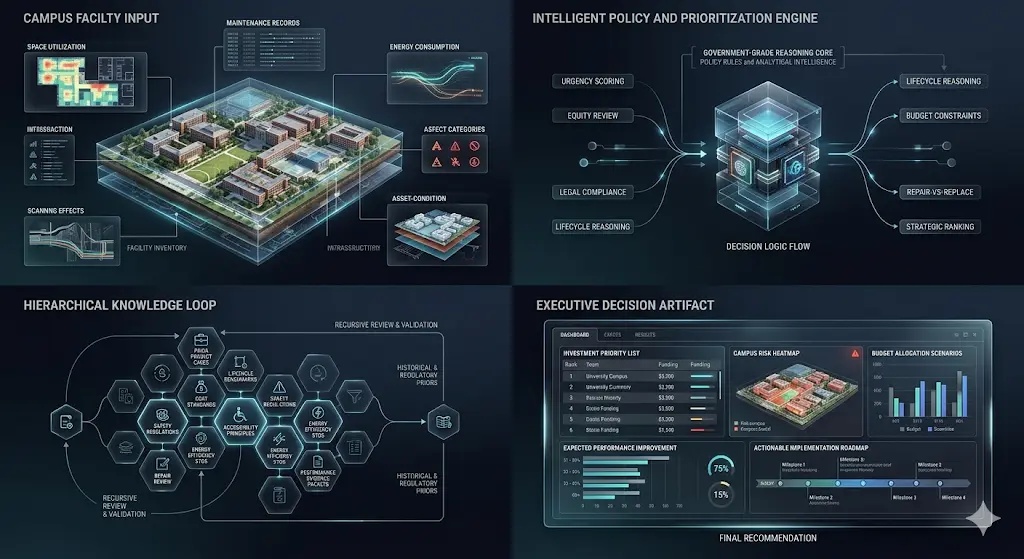
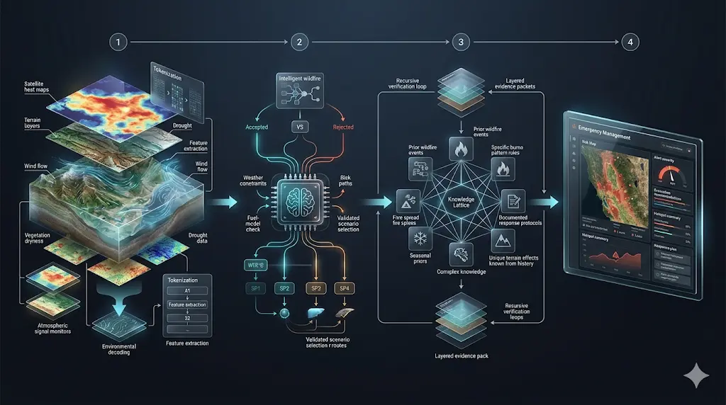
1-1. 시각적 구조 및 파이프라인 레이아웃
classDiagram
    class DarkTechPipeline {
        +Canvas: Deep Midnight Navy to Charcoal Gradient
        +FlowDirection: Left-to-Right Step-by-Step Reasoning
        +Module1_Input: Satellite Radar / Sensor Nodes
        +Module2_Process: Glowing 3D Earth Globe / Neural Heatmap
        +Module3_Output: Mission Control Dashboard / Risk Metrics
        +Connectors: Luminous energy streams and optic data ribbons
    }
- 캔버스 무드(Atmosphere):
- 짙은 미드나잇 네이비(Midnight Navy)와 흑연 차콜 톤의 고급스러운 비네팅 배경.
- 공기 중에 은은하게 떠다니는 발광 데이터 입자(Floating luminous particles).
- 핵심 모듈의 입체적 배치(3D Modules):
- 좌측: 원시 센서 관측 모듈(위성 레이더, 기상 관측 타워).
- 중앙: 빛나는 3D 지구 홀로그램 구체 또는 신경망 히트맵.
- 우측: 정밀한 지휘 통제(Command Control) 대시보드 및 리스크 평가 차트.
- 발광 커넥터(Luminous Connectors):
- 모듈 사이를 가로지르는 얇고 우아한 발광 리본과 광섬유 레이저 빔이 데이터의 흐름을 역동적으로 유도합니다.
2. 핵심 프롬프트 파라미터 및 키워드 사전
| 속성 분류 | 핵심 영문 프롬프트 키워드 | 비주얼 효과 |
|---|---|---|
| 배경 및 분위기 | deep dark navy backdrop, cinematic scientific explainer, subtle atmospheric volumetric glow |
영화적 몰입감을 부여하는 깊은 암부 |
| 파이프라인 흐름 | left-to-right multi-step reasoning pipeline, sequential workflow layout, ordered progression |
직관적인 인지 흐름을 따르는 단계별 전개 |
| 발광 시각 요소 | luminous cyan data ribbons, holographic 3D earth globe, translucent glowing micro-dashboards |
빛을 발산하는 미래형 데이터 모듈 |
| 렌더링 완성도 | presentation-ready enterprise tech infographic, hyper-detailed scientific visualization, 8k |
최고급 과학 저널 표지 수준의 디테일 |
3. 최종 핵심 마스터 프롬프트 템플릿
Design an ultra-premium cinematic scientific explainer image for [TOPIC], presented as a sophisticated left-to-right multi-step reasoning pipeline on a deep dark navy backdrop. The composition is divided into 3 to 4 sequential stages connected by luminous data ribbons and optical light pulses.

Stage 1 (Left): [입력 데이터 및 관측 장비 설명: 예: raw telemetry sensors and satellite radars].
Stage 2 (Center): [핵심 분석 및 AI 모델링 설명: 예: a glowing holographic 3D globe with interactive risk heatmaps].
Stage 3 (Right): [최종 분석 결과 및 제어 대시보드 설명: 예: precision analytics dashboard with decision metrics].

Clean typography, modular glassmorphic interface panels, soft volumetric atmospheric fog, pristine negative space around edges, award-winning scientific journal infographic aesthetic, 8k resolution --ar 16:9 --style raw --v 6.1
4. 즉시 복사 가능한 실전 생성 프롬프트 2종
4-1. [케이스 1] 기후 위기 및 산불 재난 실시간 조기 경보 파이프라인 (레퍼런스 완벽 재현)
Design an ultra-premium cinematic scientific explainer image for Wildfire Disaster Early Warning System, presented as a sophisticated left-to-right multi-step reasoning pipeline on a deep dark midnight-blue backdrop. The composition flows sequentially through three stages: On the left, satellite thermal cameras and IoT environmental sensor towers capturing real-time forest heat signatures; In the center, a stunning glowing 3D holographic terrain map with predictive AI flame spread vectors and wind dynamic ribbons; On the right, an advanced emergency dispatch command interface displaying evacuation routes and risk priority scores. Luminous cyan and amber data streams interconnecting each stage, volumetric studio lighting, photorealistic scientific render, pristine enterprise visual, 8k --ar 16:9 --style raw --v 6.14-2. [케이스 2] 차세대 금융 이상 거래 탐지(FDS) 및 실시간 블록체인 추적
A futuristic enterprise fintech infographic visualizing Real-time Fraud Detection Pipeline in a left-to-right cinematic workflow on an ultra-dark navy canvas. Left: Global banking transaction nodes emitting high-speed encrypted data packets. Center: A spinning translucent crystalline AI neural core analyzing behavioral patterns with neon-purple decision boundaries. Right: Instant automated risk mitigation lock and verified blockchain audit ledger panel. Razor-sharp holographic UI elements, vibrant electric blue and emerald glows, minimal clutter, boardroom keynote quality --ar 16:9 --v 6.15. 실무 발표 및 대형 화면 디스플레이 최적화 팁
- LED 월(Wall) 및 대형 모니터 전시:
- 다크 테마 인포그래픽은 대형 전시장 모니터나 LED 디스플레이에서 압도적인 존재감을 발휘합니다. 검은색 픽셀이 꺼지는 OLED 스크린에서는 배터리 소모를 줄이고 명암비를 극대화할 수 있습니다.
- 세부 텍스트 가독성 확보:
- 다크 배경에서는 흰색 텍스트가 번져 보일 수 있으므로(Halation 현상), 텍스트 레이블을 추가할 때는 순백색보다는 옅은 시안 그레이(#E0F2F1) 폰트 컬러를 사용하는 것이 가독성에 유리합니다.
Part 5. 사이버네틱 단면 분해도 인포그래픽
0. 왜 친근한 사물과 기계 메커니즘의 결합인가?
인공지능 트랜스포머 모델의 어텐션 메커니즘, 분산 합의 알고리즘, 인지 심리학 이론 같은 고난도 개념을 일반인에게 설명할 때 수식이나 난해한 블록 다이어그램을 들이밀면 독자는 즉시 이탈합니다. 하지만 “친숙한 유기물(과일, 일상 사물)의 껍질이 벗겨지면서 내부에 정밀한 기어박스와 전자 회로가 드러나는 사이버네틱 단면도”를 보여주면 독자는 경이로움을 느끼며 단번에 개념의 본질을 직관합니다.
graph LR
    A["난해한 추상적 이론/알고리즘"] --> B["친숙한 일상 오브젝트: 바나나/사과/전구"]
    B --> C["절개면 컷어웨이 Cutaway: 내부 티타늄 기어 & 회로 노출"]
    C --> D["부품별 인출선 Callout: 각 단계의 기능적 역할 1:1 매핑"]
    D --> E[보는 즉시 머릿속에 각인되는 사이버네틱 인포그래픽 완성]
- 인지적 친숙성과 반전의 미학: 누구나 아는 바나나의 껍질이 벗겨지는 순간, 내부에 황동 톱니바퀴와 광섬유가 맞물려 돌아가는 모습을 보며 관람자는 복잡한 시스템의 작동 원리를 직관적으로 이해합니다.
- 마이크로 디테일의 설득력: 정밀한 인출선(Leader Lines)과 부품 번호 태그가 그래픽에 압도적인 학술적·공학적 권위를 부여합니다.
1. 레퍼런스 비주얼 정밀 역공학 (Deconstruction)
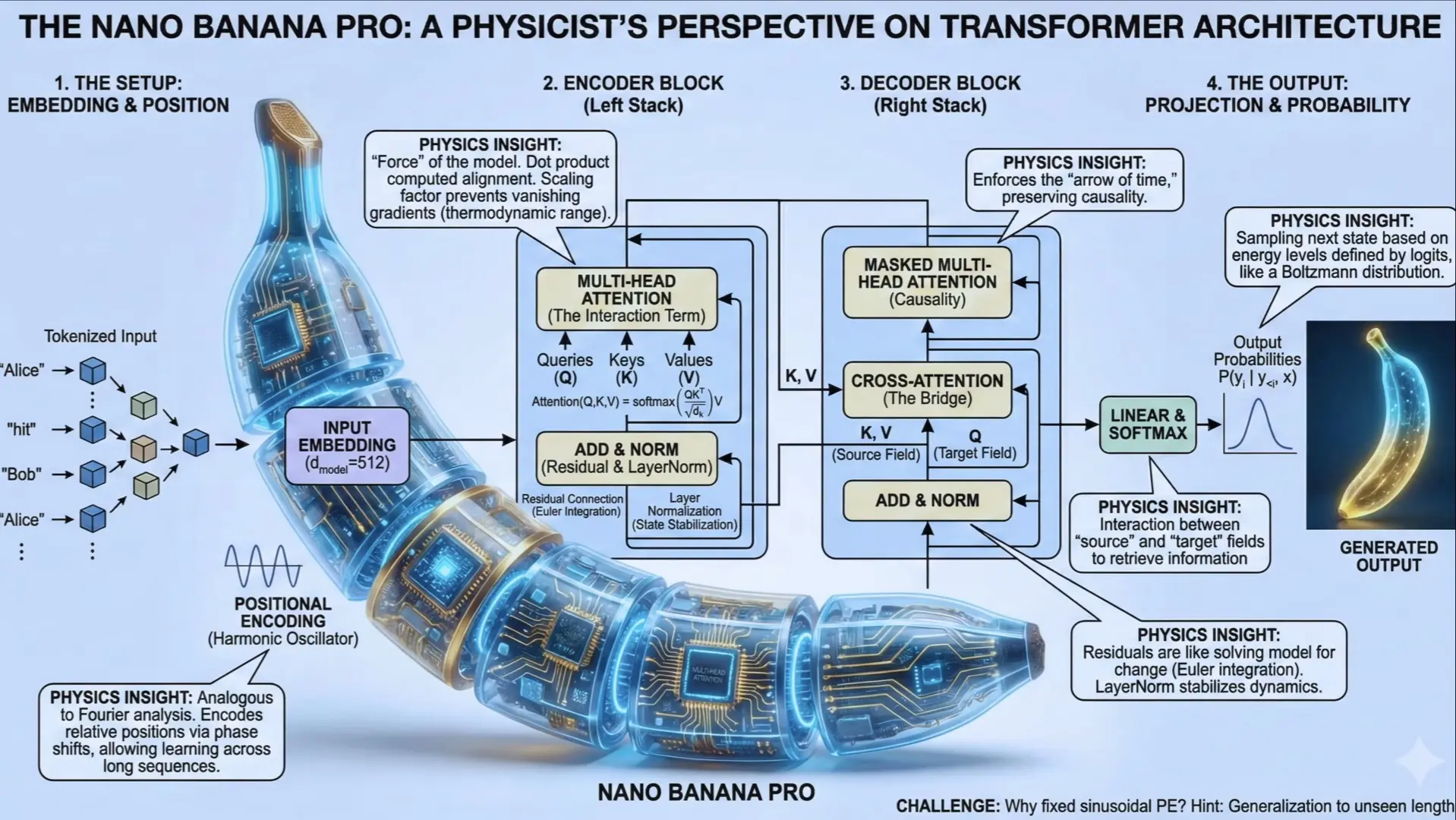
1-1. ‘인지 기어박스(Cognitive Gearbox)’ 3대 층위 분석
classDiagram
    class CyberneticExplainer {
        +OuterSkin: Natural organic texture (Peeled yellow banana peel)
        +MechanicalCore: Exposed precision titanium gears, brass cogs, servos
        +DataPathways: Glowing cyan fiber-optic cables weaving through joints
        +Annotations: Technical leader lines with part numbering tags
        +Lighting: Museum-grade studio spotlight with delicate contact shadow
    }
- 외피 층 (Organic Outer Skin):
- 겉면은 싱싱한 과일의 자연스러운 유기적 텍스처(생생한 노란색, 갈색 반점, 미세한 광택).
- 껍질이 나선형으로 자연스럽게 벗겨져 내려오며(Peeled open) 내부 메커니즘을 드러내는 관문 역할을 합니다.
- 내부 기계 코어 (Mechanical Internal Core):
- 과육 대신 정밀하게 맞물린 티타늄 크랭크축, 유압 피스톤, 황동 기어, 반투명 실리콘 칩셋.
- 부품 사이로 흐르는 발광 광섬유 배선이 에너지와 데이터의 순환을 시각화합니다.
- 학술적 주석 및 인출선 (Technical Annotations):
- 각 기계 부품을 가리키는 얇은 화이트 지시선과 부품 코드(
GEAR-01: 인지 필터링,SERVO-02: 메모리 동기화).
- 각 기계 부품을 가리키는 얇은 화이트 지시선과 부품 코드(
2. 핵심 프롬프트 파라미터 및 키워드 사전
| 속성 분류 | 핵심 영문 프롬프트 키워드 | 비주얼 효과 |
|---|---|---|
| 오브젝트 융합 | cybernetic peeled banana, organic exterior with exposed mechanical interior, cutaway diagram |
외피와 기계 내부의 극적인 컷어웨이 결합 |
| 기계 부품 디테일 | precision titanium gears, hydraulic micro-servos, glowing printed circuit boards |
정밀 시계공학 수준의 마이크로 기계 부품 |
| 주석 및 지시선 | technical callout lines, part numbering badges, macro exploded schematic |
학술 서적 단면도 같은 전문적인 주석 연출 |
| 조명 및 배경 | clean slate gray background, sharp directional studio keylight, tangible contact shadow |
제품 디자인 렌더링 수준의 고급스러운 스튜디오 조명 |
3. 마스터 JSON 메타 프롬프트 템플릿
{
  "agent_role": "Chief Prompt Engineer for Nano Banana Pro Concept Visualizer",
  "task": "복잡한 개념을 사이버네틱 과일/사물 단면 인포그래픽으로 시각화",
  "prompt_structure": {
    "subject": "[원하는 사물: 예: fresh peeled banana / ripe green apple]",
    "cutaway_reveal": "The outer skin is peeled back in an elegant curve, revealing an astonishingly complex cybernetic interior",
    "mechanical_components": [
      "Interlocking titanium and brass clockwork gears representing [개념 1]",
      "Micro-hydraulic actuators and piston rods representing [개념 2]",
      "Luminous cyan and amber printed circuit tracks representing [개념 3]"
    ],
    "annotation_elements": "Delicate white technical leader lines pointing to key components with clean sans-serif tags",
    "background_and_lighting": "Solid neutral matte gray studio backdrop, sharp directional rim lighting, photorealistic octane render, 8k resolution"
  }
}
4. 즉시 복사 가능한 실전 생성 프롬프트 2종
4-1. [케이스 1] 인지 기어박스 사이버네틱 바나나 상세도 (레퍼런스 완벽 재현)
An astonishing concept explainer infographic featuring a cybernetic peeled banana titled "The Cognitive Gearbox". The bright yellow organic peel is naturally curling backward, revealing an ultra-intricate internal machine made of precision titanium gears, miniature brass cogs, tiny hydraulic pistons, and glowing micro-processors. Luminous fiber-optic cables in neon cyan thread through the mechanical skeleton. Delicate white technical callout lines point to components with micro-labels. Studio product shot on a clean neutral gray cyclorama, sharp directional keylight, photorealistic 8k octane render, presentation masterpiece --ar 16:9 --style raw --v 6.14-2. [케이스 2] 신경망 인공지능 사과 단면도 (Neural Core Apple)
A conceptual cutaway scientific illustration of a fresh red Gala apple sliced in half vertically. The left half shows luscious organic fruit pulp, while the right half reveals a breathtaking quantum computing core with glowing optical lattice pathways, microchip matrices, and gold nano-wires pulsing with purple energy. Subtle technical blueprint grid in the background, museum archival quality, macro industrial design render --ar 16:9 --v 6.15. 교육 콘텐츠 및 콘텐츠 마케팅 활용법
- 기술 블로그 및 뉴스레터 대표 썸네일:
- 바나나 속에서 기계가 튀어나오는 비주얼은 사용자가 피드를 내리다 100% 멈춰 서게 만드는 강력한 시각적 후킹(Hooking)을 제공합니다.
- 복잡한 개념의 비유적 강의 교재:
- “우리의 뇌는 바나나 껍질처럼 부드러운 감정으로 둘러싸여 있지만, 내부에는 이 기어들처럼 정밀한 논리 프로세서가 작동합니다”라는 식의 스토리텔링과 결합하면 교육 효과가 극대화됩니다.
Part 6. 아날로그 페이퍼 전시 보드 인포그래픽
0. 디지털 피로감의 해독제: 촉각적 종이 미학(Tactile Paper Aesthetic)
모든 것이 번쩍이는 매끄러운 유리 화면(디지털 스크린)으로 대체된 오늘날, 사람들은 역설적으로 “손으로 만질 수 있을 것 같은 종이의 오돌토돌한 질감(Texture)과 물리적인 두께감”에 따뜻한 감성과 높은 신뢰를 느낍니다.
graph TD
    A[차가운 평면 디지털 인포그래픽] -->|시각적 피로 및 낮은 정서적 교감| B[관람자 이탈]
    C[아날로그 입체 전시 보드 기법] -->|두꺼운 판지 카드, 금속 핀, 레이어 단차| D[손에 잡힐 듯한 촉각적 호기심 유발]
    D --> E[교육, 정책, 브랜딩에서 독보적인 전달력 확보]
- 종이 공작(Paper Craft)과 입체 전시의 융합: 평면 인포그래픽이 아닌, 박물관의 표본 전시 보드나 고급 디자인 스튜디오의 무드보드처럼 각 정보 카드가 물리적인 그림자를 드리우며 떠 있습니다.
- 친근하면서도 체계적인 분류학(Taxonomy): 복잡한 프레임워크나 학습 설계를 종이 키보드나 분류 카드 형태로 배치하여 학습자의 심리적 장벽을 낮춥니다.
1. 레퍼런스 비주얼 정밀 분석 (Deconstruction)
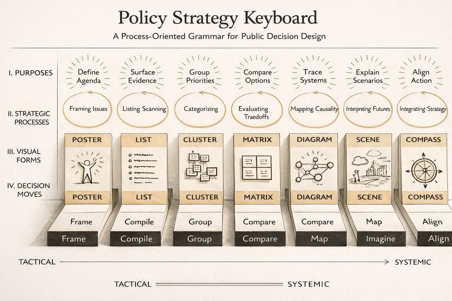
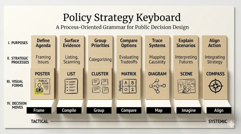
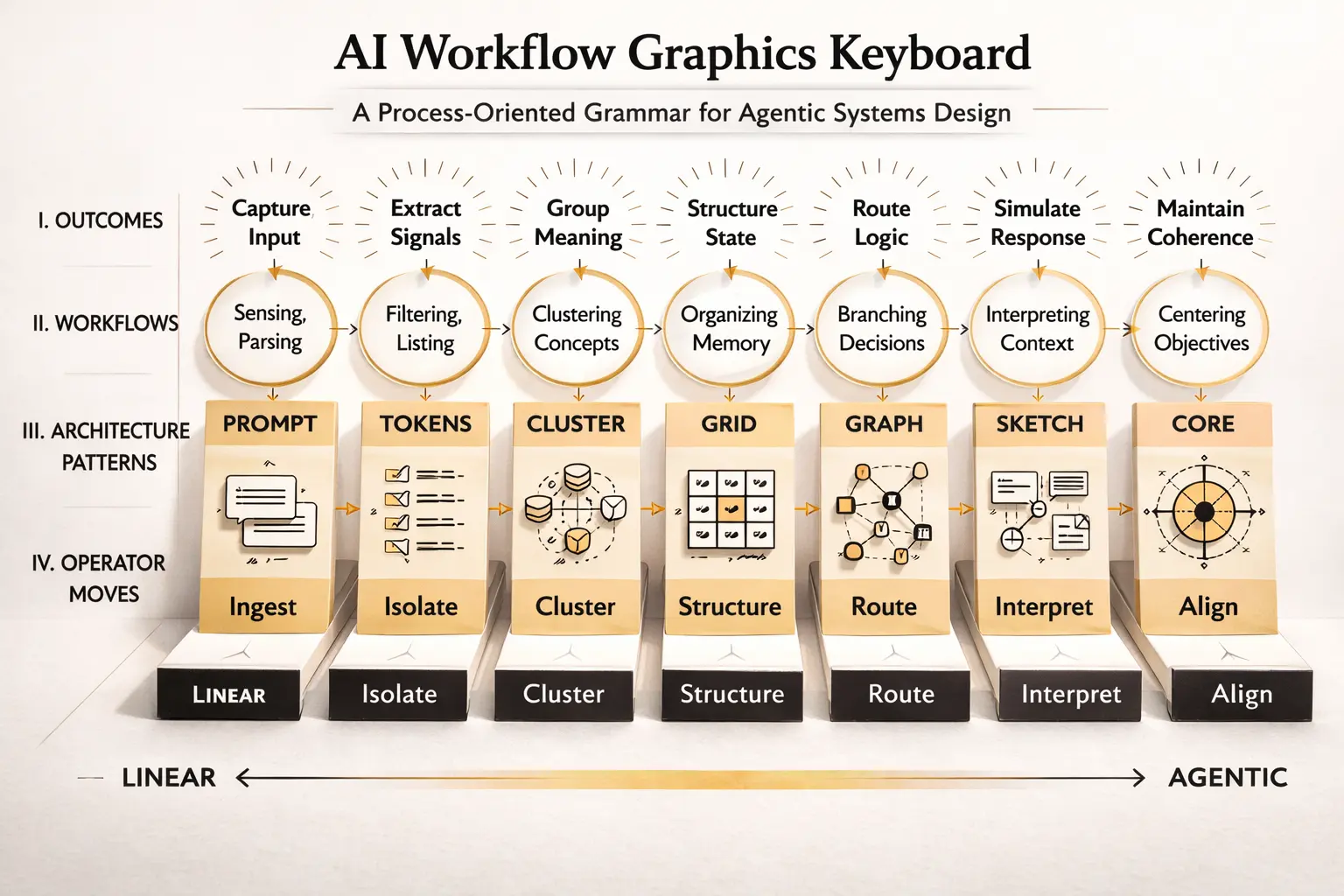
1-1. 시각적 구조 및 촉각 요소 분해도
classDiagram
    class PaperExhibit {
        +BaseBoard: Heavy textured Kraft paper or Warm Ivory mount board
        +LayeredCards: Thick die-cut cardstocks with beveled edges
        +Fasteners: Miniature brass pushpins, metallic paperclips, washi tape
        +Lighting: Warm directional desk lamp light creating soft natural drop shadows
        +Typography: Crisp letterpress embossed sans-serif and editorial serif
    }
- 마운트 보드(Mount Board Base):
- 바탕면은 거친 질감이 살아있는 크라프트지(Kraft paper), 리넨 천, 또는 두꺼운 미술용 하드보드지.
- 종이 특유의 미세한 섬유질(Pulp grain)과 따뜻한 웜화이트 톤.
- 다층 종이 카드(Die-cut Cards):
- 정보 단위별로 칼로 정교하게 재단된 두꺼운 판지(Cardstock) 조각들이 여러 겹 겹쳐져 있습니다.
- 각 카드 테두리 아래로 생기는 실제 종이 두께만큼의 자연스러운 그림자.
- 물리적 고정 장치(Physical Fasteners):
- 황동 핀(Brass pins), 은색 클립(Paperclips), 마스킹 테이프(Washi tape) 등 손으로 직접 꽂아 넣은 듯한 아날로그 소품.
2. 핵심 프롬프트 파라미터 및 키워드 사전
| 구성 카테고리 | 필수 영문 프롬프트 키워드 | 비주얼 효과 |
|---|---|---|
| 종이 재질감 | tactile paper-exhibit taxonomy board, thick layered cardstock, visible fibrous paper pulp texture |
오돌토돌 만져질 듯한 고급 수제 종이 질감 |
| 입체감 및 그림자 | realistic physical drop shadows, die-cut beveled edges, relief layering |
종이 두께에 따른 실감나는 입체 단차 |
| 아날로그 오브젝트 | brass pushpins, minimalist metallic paperclips, subtle embossed letterpress text |
전시 보드 특유의 수작업 고정 디테일 |
| 조명 및 앵글 | warm studio directional desk lamp lighting, slight overhead top-down perspective |
따뜻하고 자연스러운 작업실 조명 분위기 |
3. 최종 핵심 일반화 마스터 프롬프트
Create a highly structured landscape educational infographic poster that looks like a tactile paper-exhibit taxonomy board, not a flat digital graphic.

Core Theme: [TOPIC: 예: Instructional Design Framework / IT System Architecture].
The canvas is a heavy, warm-ivory textured mount board. Multiple thick, die-cut cardstock panels are arranged in a structured hierarchy, fastened with miniature brass pins and subtle paperclips. Each card features clear modular categories, embossed letterpress headers, and crisp minimal icons.

The lighting is a soft directional warm studio key light casting genuine, tangible soft drop shadows beneath each paper card, emphasizing the physical relief layers. Nostalgic yet ultra-modern Scandinavian museum exhibit aesthetic, high-end editorial graphic art, 8k resolution --ar 16:9 --style raw --v 6.1
4. 즉시 복사 가능한 실전 생성 프롬프트 2종
4-1. [케이스 1] 교육 학습 설계 프레임워크 전시 포스터 (레퍼런스 완벽 재현)
A breathtaking tactile paper-exhibit taxonomy poster illustrating an Instructional Learning Design Framework. Landscape 16:9 composition on a premium heavy cream-colored pulp artboard. Across the center, thick laser-cut matte cards styled like mechanical keyboard keys representing instructional phases (Analyze, Design, Develop, Implement, Evaluate). Each paper key has a distinct pastel tone (sage green, muted mustard, dusty blue) with crisp debossed typography. Real paper fiber grain visible on macro inspection, delicate brass paperclips holding reference notes, soft natural desk lamp shadows creating multi-level depth. Award-winning exhibition poster design --ar 16:9 --v 6.14-2. [케이스 2] 정부 정책 및 공공 혁신 전략 체계도
A sophisticated analog paper-craft exhibition board visualizing a National Public Innovation Policy Strategy. Crisp white and raw cardboard layered panels pinned to a museum-grade linen textured board with matte gold thumbtacks. Flowing string lines connecting policy goals to tactical execution cards. Hand-stamped vintage numbering, elegant architectural minimalism, tactile shadow relief, zero glossy digital glare, museum archive quality --ar 16:9 --style raw --v 6.15. 실무 인쇄 및 브랜딩 활용 팁
- 실제 오프라인 포스터 및 리포트 표지 인쇄:
- 이 스타일의 이미지는 디지털 웹뿐 아니라 실제 사보(House Organ), 연구 보고서 표지, 학술 포스터로 인쇄할 때 엄청난 고급감을 발휘합니다.
- 독자의 심리적 안정감 유도:
- 난해한 정책 문서나 복잡한 법률, 교육학 가이드라인의 첫 페이지에 이 비주얼을 배치하면, 독자가 느끼는 학습 저항감을 대폭 낮추고 친근하게 내용에 몰입하도록 유도합니다.
Part 7. 신기술 발표 테크 런칭 원페이지 포스터
0. 왜 수십 장의 슬라이드 대신 ’단 한 장의 원페이지 포스터’인가?
글로벌 테크 컨퍼런스(CES, WWDC, Google I/O)나 학술 심포지엄에서 청중과 투자자의 시선을 단번에 사로잡는 것은 50장짜리 발표 슬라이드가 아닙니다. 제품의 기술적 정수, 핵심 차별점, 벤치마크 지표를 단 한 장에 집약한 ‘원페이지 테크 인포그래픽 포스터(One-Pager Tech Poster)’입니다.
graph TD
    A["상단 헤더: 제품명, 카테고리 태그, 핵심 가치 슬로건"] --> B["중앙 3D Hero Object: 핵심 물리/시각적 상징체"]
    B --> C["좌측 패널: 3대 핵심 기술 기능 아키텍처"]
    B --> D["우측 패널: 3대 벤치마크 성능 및 비즈니스 ROI 지표"]
    C & D --> E["하단 푸터 바: 하드웨어 사양, 호환성 및 출시 일정"]
- 시선 집중의 구심점(Centerpiece Anchor): 화면 중앙에 압도적인 3D 비주얼을 배치하고 좌우에 기능과 성능 카드를 대칭으로 정렬하여, 청중이 5초 이내에 제품의 정체성을 스캔하도록 설계합니다.
- 정보 밀도와 미니멀리즘의 공존: 복잡한 사양서를 지루하지 않게 모듈러 카드(Modular Cards)로 블록화하여 시각적 피로감을 없앱니다.
1. 레퍼런스 포스터 정밀 역공학 (Reverse Engineering)
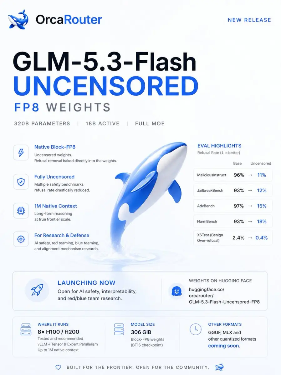
1-1. 그리드 시스템 및 레이아웃 분해도
classDiagram
    class TechLaunchPoster {
        +AspectRatio: 16:9 Widescreen or 3:4 Vertical Poster
        +Canvas: Clean Studio Warm-White with Subtle Grid
        +TopHeader: Big Bold Title + Tagline + Tech Pill Badges
        +LeftColumn: 3 Vertical Feature Cards (Architecture)
        +CenterStage: Floating 3D Hero Object with Volumetric Glow
        +RightColumn: 3 Vertical Metric Cards (Benchmark / ROI)
        +BottomFooter: Horizontal Spec Matrix Bar
    }
- 중앙 Hero Object (화면의 40~50%):
- 제품 본체 또는 기술적 메타포를 상징하는 3D 렌더링. 투명 글래스, 세라믹 폴리머, 발광 코어의 물성을 적용하여 시각적 앵커 역할을 합니다.
- 좌측 열 (Feature Cards):
- 3개의 독립된 라운드 사각형 카드. 기술의 핵심 역량(예: 고속 연산, 보안 격리, 확장성)을 간결한 픽토그램과 함께 배치.
- 우측 열 (Performance & Metrics):
- 3개의 데이터 지표 카드. 대형 숫자(예:
10x Faster,99.9% Accuracy,45% Cost Down)와 방사형 차트/진행률 바로 정량적 근거를 제시.
- 3개의 데이터 지표 카드. 대형 숫자(예:
- 하단 푸터 바 (Technical Specifications):
- 칩셋 규격, API 연동성, 보안 인증 마크 등이 미니멀한 텍스트로 정렬되는 베이스라인.
2. 디자인 시스템 및 핵심 프롬프트 키워드
| 디자인 축 | 필수 영문 프롬프트 키워드 | 시각적 특징 |
|---|---|---|
| 포스터 구도 | product launch one-pager poster, balanced symmetrical 3-column layout, central hero object |
전문 테크 발표용 3단 균형 인포그래픽 |
| 중앙 오브젝트 | floating tactile 3D core device, claymorphism and glassmorphism, soft volumetric studio light |
손에 잡힐 듯 입체감이 살아있는 히어로 비주얼 |
| 데이터 카드 | modular glassmorphic UI cards, bold typographic metrics, minimal vector pictograms |
가독성이 뛰어난 현대적 정보 카드 |
| 배경 및 분위기 | ultra-clean off-white cyclorama, delicate technical hairline grid, presentation ready |
군더더기 없는 프리미엄 실리콘밸리 런칭 덱 무드 |
3. 마스터 메타 프롬프트 템플릿
당신은 Apple, Tesla, OpenAI의 신제품 발표 키비주얼을 총괄하는 수석 크리에이티브 디렉터입니다.
아래 [신제품/기술 정보]를 바탕으로, Midjourney v6.1에 입력할 완벽한 [원페이지 테크 인포그래픽 포스터 영문 프롬프트 1개]를 작성하세요.

[필수 구조]
1. 16:9 와이드스크린 또는 3:4 세로형 포스터 레이아웃, 무결점 스튜디오 웜화이트 배경.
2. 상단: 볼드한 산세리프 제품명 및 카테고리 태그 뱃지.
3. 중앙: [제품의 정체성]을 상징하는 거대한 3D 히어로 오브젝트 (Glass & Matte Ceramic).
4. 좌측 3개 카드: 핵심 기술 아키텍처 및 기능 설명.
5. 우측 3개 카드: 볼드한 벤치마크 숫자(10x, 99.9% 등)와 시각 차트.
6. 하단: 정밀한 테크 스펙 및 호환성 바.

[신제품/기술 정보]: {여기에 소개할 제품이나 AI 모델, 솔루션의 특징을 입력하세요}
4. 즉시 복사 가능한 실전 생성 프롬프트 2종
4-1. [케이스 1] 차세대 온디바이스 NPU AI 칩셋 런칭 포스터 (레퍼런스 완벽 재현)
A professional product launch one-pager infographic poster for a Next-Gen On-Device NPU Chipset in 16:9 widescreen format. Ultra-clean off-white studio background with faint technical coordinate grid lines.

CENTER: A massive, stunning floating 3D hero object—a layered silicon microchip with an illuminated translucent cybernetic core glowing in subtle cyan and violet, enclosed in beveled crystal glass.

LEFT SIDE: Three vertically stacked elegant glassmorphic cards describing architectural pillars: "01 Ultra-low Latency", "02 Neural Engine", "03 Hardware Cryptography", each with crisp minimalist line icons.

RIGHT SIDE: Three matching performance metric cards featuring bold numbers: "15x TOPS Performance", "60% Energy Efficiency", and "0.2ms Inference Speed" with clean micro-graphs.

TOP: Bold modern sans-serif typography "AETHER-X1 NPU" with small category pills. BOTTOM: A clean horizontal specification matrix bar. Minimalist corporate tech aesthetic, pristine negative space, 8k resolution --ar 16:9 --style raw --v 6.1
4-2. [케이스 2] 자율주행 전기차(EV) 스마트 운영체제 쇼케이스
A high-impact technology showcase one-pager poster for an Autonomous Vehicle Operating System. Crisp studio ivory background. Centerpiece: a floating aerodynamic 3D transparent glass vehicle chassis showing sensor fusion rays and an illuminated central AI computing tower. Left panel: 3 rounded rectangular cards detailing LiDAR Perception, Real-time Edge Planning, and V2X Grid Comms. Right panel: 3 metric cards highlighting "99.999% Collision Avoidance", "Level 4 Ready", and "Zero Downtime OTA". Minimalist Scandinavian design, sharp typography, high-end automotive keynote deck standard --ar 16:9 --v 6.15. 실무 발표 및 배포 팁
- Figma에서 데이터 실시간 업데이트:
- AI로 생성된 기본 3D 포스터 템플릿의 숫자와 텍스트 부분을 Figma에서 실제 최신 벤치마크 수치로 덮어쓰기(Overlay)하여 정기 기술 보고서 템플릿으로 자산화할 수 있습니다.
- A1 규격 대형 인쇄 및 부스 전시:
- 이미지 업스케일러(Magnific AI, Topaz Gigapixel)를 활용하여 8K 이상으로 해상도를 끌어올리면 전시회 부스의 대형 배너로 즉시 인쇄 출력 가능합니다.
참고문헌 및 권위 출처
- Tufte, E. R. (2001). The Visual Display of Quantitative Information (2nd ed.). Graphics Press. https://www.edwardtufte.com/books/
- W3C Web Accessibility Initiative (WAI). Web Content Accessibility Guidelines (WCAG) 2.1 - Visual Presentation & Contrast. https://www.w3.org/WAI/standards-guidelines/wcag/
- Midjourney Documentation. Official Prompting & Parameter Reference. https://docs.midjourney.com/