graph TD
    A["난해한 엔터프라이즈 아키텍처/거버넌스"] --> B[스타트업 워룸 화이트보드 캔버스]
    B --> C[손으로 그린 서버 랙, DB 실린더, 방화벽 방패 아이콘]
    C --> D["컬러풀 포스트잇 주석 & 마커펜 하이라이트"]
    D --> E[모든 직군이 단번에 이해하는 생생한 전략 아키텍처 완성]
노트📌 본 가이드의 구성 및 학습 목표
본 문서는 AI 스케치노트 & 손그림 드로잉 시각화의 모든 핵심 기법을 한곳에 집대성한 종합 실전 가이드입니다. 총 5가지 세부 테마별 프롬프트 구조와 시각적 문법, 실전 프롬프트 템플릿을 단계별로 학습하실 수 있습니다.
📚 세부 테마 목차
| 파트 | 주제 | 핵심 시각화 대상 |
|---|---|---|
| Part 1 | 엔터프라이즈 화이트보드 스케치노트 다이어그램 | 엔터프라이즈 화이트보드 스케치노트 다이어그램 |
| Part 2 | 화이트보드 3단 비교 교육용 스케치노트 | 화이트보드 3단 비교 교육용 스케치노트 |
| Part 3 | 잉크 손그림과 말풍선 비주얼 스케치노트 | 잉크 손그림과 말풍선 비주얼 스케치노트 |
| Part 4 | 실사 사진 위 감성 낙서(Doodle) 드로잉 합성 | 실사 사진 위 감성 낙서(Doodle) 드로잉 합성 |
| Part 5 | 그림판 감성의 B급 낙서(Crappy Doodle) 드로잉 | 그림판 감성의 B급 낙서(Crappy Doodle) 드로잉 |
Part 1. 엔터프라이즈 화이트보드 스케치노트 다이어그램
0. 딱딱한 기업 아키텍처를 살아 숨쉬게 만드는 ‘보드룸 스케치’
IT 거버넌스, 규제 준수(Compliance), 엔터프라이즈 클라우드 전환 전략 같은 주제는 듣는 것만으로도 지루하기 십상입니다. 회사의 중역이나 비개발 직군 임원진에게 이러한 복잡한 시스템을 설명할 때, Visio나 정형화된 아키텍처 툴의 딱딱한 박스 다이어그램은 오히려 거부감을 부릅니다.
하지만 “CTO가 회의실 화이트보드에 직접 펠트 마커를 들고 핵심 뼈대와 흐름을 직관적으로 그려준 듯한 엔터프라이즈 스케치노트”는 엄청난 흡입력과 친밀한 설득력을 발휘합니다.
- 권위와 친근함의 완벽한 밸런스: 기업의 핵심 아키텍처라는 고도의 전문성을 담고 있으면서도, 손그림 특유의 경쾌함으로 접근성을 극대화합니다.
- 실제 회의실의 현장감(Authenticity): 마커 잉크의 미세한 번짐, 점선 화살표, 지우개 자국이 살아있어 마치 방금 끝난 최고 브레인스토밍의 결정체를 엿보는 듯한 착각을 줍니다.
1. 레퍼런스 비주얼 정밀 분석 (Deconstruction)
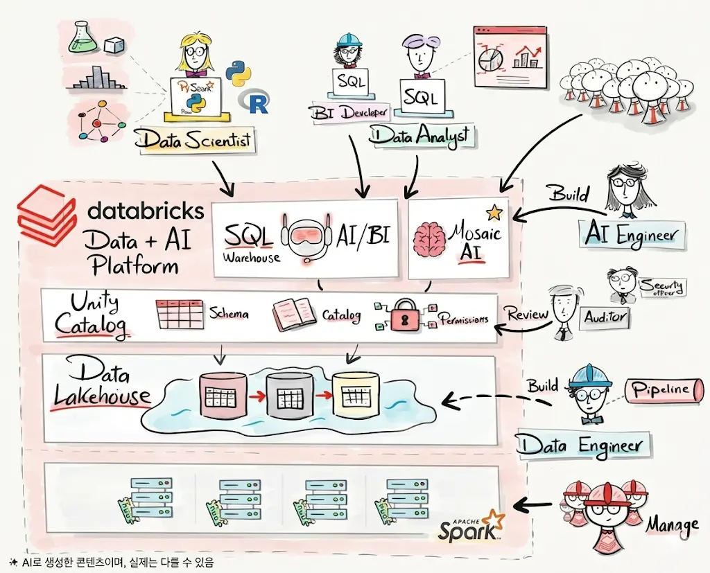
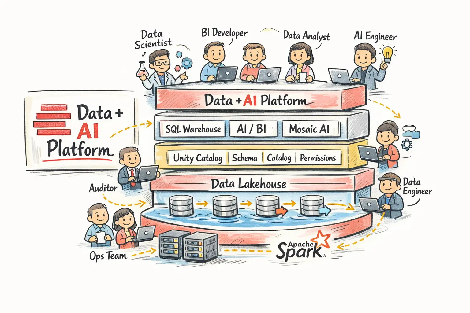
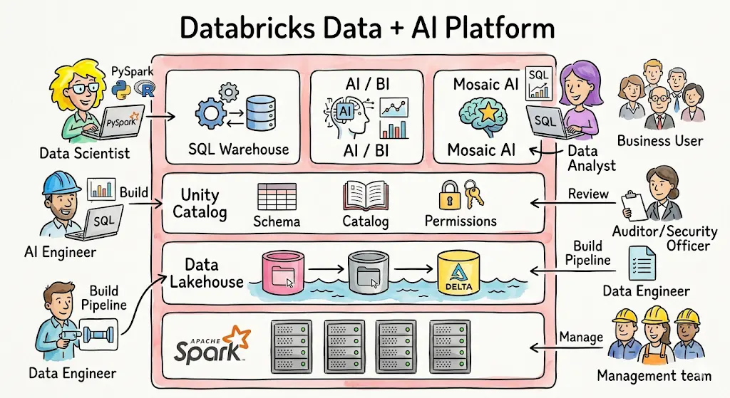
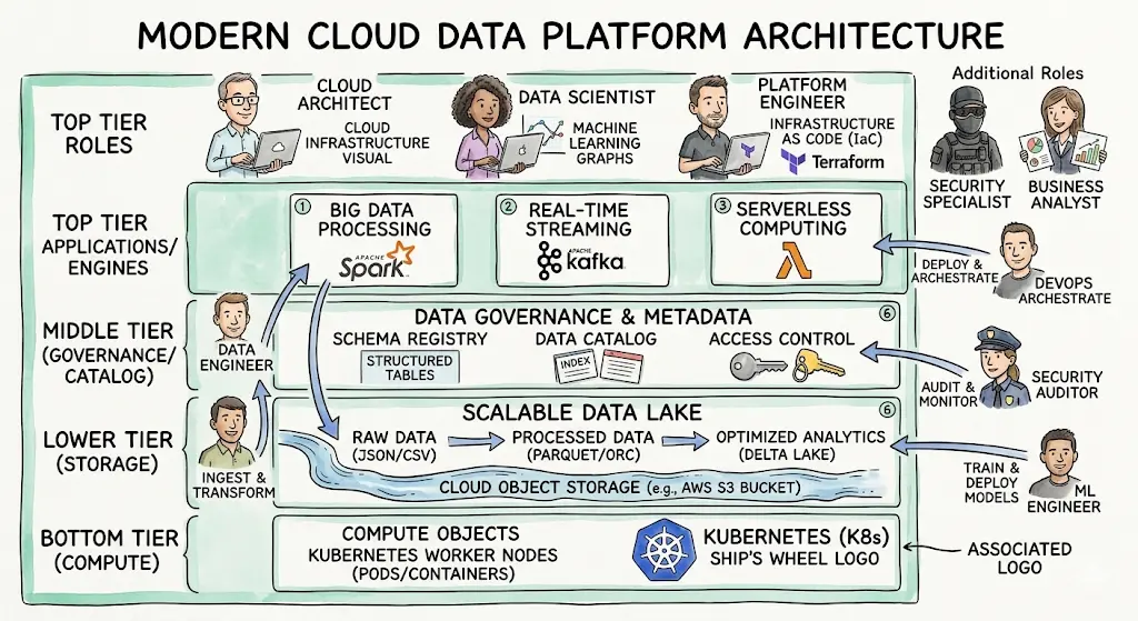
1-1. 스타일 구성 4대 시각 문법
classDiagram
    class EnterpriseSketchnote {
        +BoardCanvas: Realistic magnetic whiteboard with subtle sheen and eraser marks
        +MarkerPalette: Black outline (70%) + Deep Navy (15%) + Accent Coral & Teal (15%)
        +Components: Doodled cloud shapes, server blocks, cylinder DBs, lock shields
        +LayoutStructure: Symmetrical enterprise architecture flow or hub-and-spoke
        +AnnotationLayers: Pastel sticky note pads, dotted connectors, callout boxes
    }
- 보드 질감과 마커 물성(Surface & Inks):
- 약간의 광택과 모서리 마커 홀더, 자석 핀이 보이는 실제 화이트보드 환경.
- 굵은 블랙 치젤 팁(Chisel tip) 마커의 듬직한 외곽선과 펠트펜 특유의 번짐감.
- 추상화된 인프라 아이콘(Infrastructure Doodles):
- 손으로 그린 폭신한 구름(Cloud), 3층 원통 케이크 모양의 데이터베이스, 번개 모양의 API 게이트웨이, 방패 모양의 방화벽.
- 포스트잇과 하이라이트(Sticky Notes & Annotations):
- 노란색, 민트색 3M 포스트잇 메모지가 다이어그램 옆에 살짝 붙어있어 중요한 비즈니스 규칙과 정책을 친절하게 짚어줍니다.
2. 엔터프라이즈 스케치노트 핵심 프롬프트 키워드
| 속성 분류 | 즉시 복사 영문 키워드 블록 | 시각적 특징 |
|---|---|---|
| 캔버스 환경 | authentic office whiteboard texture, dry-erase marker drawing, subtle eraser shadow |
실제 회의실 화이트보드의 사실적 현장감 |
| 화풍 및 드로잉 | enterprise tech sketchnote, professional hand-drawn architecture diagram, chisel-tip lines |
세련되고 정돈된 기업용 그래픽 레코딩 |
| 구성 요소 | doodled server blocks, database cylinders, cloud icons, API pipelines, sticky note callouts |
직관적인 인프라 손그림 심볼 체계 |
| 컬러 코딩 | black line art with corporate blue, energetic teal, and fluorescent yellow accents |
과하지 않고 신뢰감을 주는 절제된 색상 |
3. 마스터 프롬프트 템플릿 및 실전 생성 프롬프트
3-1. 엔터프라이즈 아키텍처 스케치노트 마스터 템플릿
A professional enterprise tech architecture sketchnote drawn on a realistic office whiteboard.

TOPIC: [ENTERPRISE_SYSTEM_TOPIC: 예: Global Multi-Cloud Data Governance Architecture].
The canvas is a clean magnetic whiteboard with natural lighting and faint marker wipe textures.

All system components are drawn in a clean, sophisticated dry-erase marker style with consistent black outlines and confident strokes:
- Ingestion Layer: Hand-drawn IoT sensors and mobile client icons connected by dotted arrows.
- Core Infrastructure: Centered cloud cluster doodle with stylized microservice cubes and database cylinders.
- Security & Governance: Hand-sketched padlock shields and policy badges highlighted with fluorescent yellow marker.
- Analytics & Output: Sleek line chart doodles and executive KPI gauge sketches on the right.

Charming pastel sticky note annotations, hand-drawn flowchart brackets, crisp and legible graphic recording standard, corporate boardroom keynote aesthetic --ar 16:9 --style raw --v 6.1
3-2. 실전 생성 프롬프트 예시 (클라우드 데이터 레이크 거버넌스)
A high-end enterprise IT sketchnote illustration of a Cloud Data Lakehouse Architecture on an authentic executive meeting room whiteboard. Drawn with crisp black and deep navy dry-erase chisel-tip markers. Features hand-sketched components: streaming event queues with lightning doodles, a multi-layered data lake cylinder, Spark processing gears, and an AI intelligence hub radiating soft teal marker highlights. Yellow and coral sticky notes pinned to the board with hand-lettered business metrics. Clean, structured, highly professional, zero messy scribble, boardroom presentation ready --ar 16:9 --style raw --v 6.14. 실무 보고서 및 제안서 후가공 팁
- 화이트보드 프레임 크롭(Crop) 기법:
- 이미지의 화이트보드 알루미늄 프레임을 포토샵에서 잘라내고 순수 마커 드로잉 부분만 슬라이드에 얹으면, 마치 슬라이드 자체가 화이트보드가 된 듯한 일체감을 연출할 수 있습니다.
- 실제 포스트잇 실물 합성:
- 생성된 다이어그램을 출력한 뒤, 팀원들이 직접 실제 포스트잇에 아이디어를 적어 붙이고 이를 다시 사진으로 찍어 프로젝트 회고록에 넣으면 최고의 팀 협업 아티팩트가 됩니다.
Part 2. 화이트보드 3단 비교 교육용 스케치노트
0. 왜 차가운 도표 대신 ’화이트보드 스케치노트(Sketchnote)’인가?
사람들은 완벽하게 정돈된 컴퓨터 그래픽 도표보다, “전문가가 화이트보드 앞에서 마커를 쥐고 열정적으로 그려준 듯한 친근한 스케치노트”에 훨씬 더 깊은 신뢰와 몰입을 느낍니다. 스케치노트는 글자와 그림, 화살표, 강조 스티커가 유기적으로 어우러져 두뇌의 좌뇌(텍스트)와 우뇌(이미지)를 동시에 자극하는 최고의 학습 도구입니다.
graph TD
    A[복잡한 비교 대상 3종] --> B["1단계: 텍스트 핵심 요점 및 대비 구조화"]
    B --> C["2단계: 화이트보드 마커펜 스케치노트 이미지 렌더링"]
    C --> D["3단 종대 비교 레이아웃: 옵션 A vs B vs C"]
    D --> E["형광펜 하이라이트 & 손그림 화살표로 직관적 학습 완료"]
- 인지 부하의 획기적 분산: 어려운 기술 용어를 아기자기한 마커 손그림 아이콘으로 치환하여 초보자도 거부감 없이 접근할 수 있습니다.
- 3단 비교(3-Tier Comparison)의 명쾌함: ’기존 방식(과거) \(\rightarrow\) 과도기적 대안(현재) \(\rightarrow\) 궁극의 해결책(미래)’의 3단 구조로 솔루션의 우월성을 명확히 입증합니다.
1. 레퍼런스 비주얼 정밀 분석 (Deconstruction)
1-1. 스케치노트 시각 문법 4대 핵심 규칙
classDiagram
    class SketchnoteGrammar {
        +Canvas: Matte off-white whiteboard with subtle eraser smudges
        +PrimaryStroke: Black chisel-tip felt whiteboard marker
        +AccentColors: Highlighter Yellow, Soft Cyan, Vibrant Coral
        +Structure: 3-column comparative cards or sequential comic panels
        +Annotations: Dotted arrows, speech bubbles, sticky note pads
    }
- 캔버스 표면(Whiteboard Canvas):
- 번쩍이는 형광등 반사가 없는 매트한 오프화이트 화이트보드.
- 지우개로 살짝 지운 듯한 자연스러운 마커 지움 자국(Subtle dry-erase marker smudges)이 아날로그 감성을 배가시킵니다.
- 선화의 필압(Line Weight):
- 납작한 끌 팁(Chisel tip) 마커로 그은 듯한 자연스러운 굵기 변화와 손떨림.
- 형광펜 악센트(Highlighter Accents):
- 전체 캔버스는 검은색 마커가 지배하되, 핵심 키워드와 승리 옵션에만 형광 노랑(#FFF500) 또는 민트 블루(#00F0FF) 하이라이트를 칠해 시선을 유도합니다.
- 시선 유도 화살표(Guiding Connectors):
- 손으로 그린 구불구불한 점선 화살표, 별표 강조 마크, 느낌표가 정보의 흐름을 이끕니다.
2. 2단계(2-Stage) 스케치노트 생성 워크플로우
고품질 스케치노트를 생성하기 위해서는 ’텍스트 구조화’와 ’이미지 렌더링’을 분리하여 실행하는 것이 가장 안정적입니다.
2-1. [1단계] 텍스트 구조화 프롬프트 (ChatGPT / Claude 용)
[TOPIC: 예: 클라우드 서버 아키텍처 비교]에 대해 교육용 화이트보드 스케치노트를 제작하려고 합니다.
아래 형식으로 내용을 먼저 요약 정리해 주세요:
1. 메인 타이틀 (손글씨 느낌의 위트 있는 제목)
2. 3단 비교 대상 정의: Option A (온프레미스) vs Option B (단일 클라우드) vs Option C (멀티클라우드)
3. 각 대상별 핵심 특징 3가지와 상징 아이콘 묘사
4. 최종 승자(추천안) 선정 및 형광펜 강조 카피
2-2. [2단계] 이미지 생성 마스터 프롬프트 (Midjourney / FLUX 용)
A professional educational whiteboard sketchnote infographic comparing [TOPIC] in a clear 3-column layout. The canvas is a realistic clean off-white whiteboard with faint dry-erase marker textures.

All graphics, charts, and diagrams are drawn with black chisel-tip whiteboard markers with lively, expressive hand-drawn lines.

Left Column: Option A with simple doodle icons and negative red marker cross marks.
Center Column: Option B with neutral blue marker annotations.
Right Column: Option C prominently highlighted with fluorescent yellow highlighter strokes, surrounded by sparkling hand-drawn stars, green checkmarks, and a cheerful cartoon lightbulb.

Dotted arrows, speech bubbles, and charming doodle illustrations guiding the viewer's eye across the board. Crisp, organized, legible graphic recording style, Scandinavian educational poster aesthetic --ar 16:9 --style raw --v 6.1
3. 즉시 복사 가능한 실전 생성 프롬프트 2종
3-1. [케이스 1] 주니어 vs 시니어 개발자의 문제 해결 방식 3단 비교
A charming educational whiteboard sketchnote infographic comparing "Junior vs Mid-level vs Senior Developer Problem-Solving Mindsets" in a 3-column comic layout. Drawn with authentic black dry-erase markers on a clean white board. Column 1 (Junior): Frantic tangled scribbles, error codes, and a doodle of a stressed cartoon figure with question marks. Column 2 (Mid-level): Stack of orderly documentation books and systematic flowcharts. Column 3 (Senior): Relaxed cartoon figure sipping coffee, pointing to a simple 3-step master plan glowing with yellow highlighter accents and green checkmarks. Engaging sketchnote recording, warm handwritten tech blog visual --ar 16:9 --v 6.13-2. [케이스 2] 3대 생성형 AI 모델(Claude vs ChatGPT vs Gemini) 스케치노트
An ultra-clear tech comparison sketchnote on a whiteboard analyzing Three Leading AI Models in three distinct sketched panels. Hand-drawn with bold marker strokes and colorful highlighter accents (teal, purple, orange). Left: Claude analyzed as an articulate writer with parchment doodles. Center: ChatGPT analyzed as an all-round polymath with Swiss army knife sketches. Right: Gemini analyzed as a lightning-fast multimodal speedster with lightning bolts and camera lens drawings. Engaging visual hierarchy, charming tech doodles, boardroom presentation quality --ar 16:9 --v 6.14. 실무 교육 및 소셜 미디어 활용 팁
- 사내 교육 및 기술 문서 위키(Confluence) 탑재:
- 이 스타일은 신입 사원 온보딩 문서나 기술 위키에 삽입했을 때 완독률을 4배 이상 높여줍니다.
- 핸드라이팅 폰트와의 결합:
- AI 생성 이미지의 빈 칠판 공간에 ‘배달의민족 주아체’나 ‘나눔손글씨’ 같은 친근한 손글씨 웹폰트를 얹으면 완벽한 한국어 로컬라이징 스케치노트가 완성됩니다.
Part 3. 잉크 손그림과 말풍선 비주얼 스케치노트
0. 왜 격식 있는 다이어그램보다 ’손글씨 손그림’에 끌리는가?
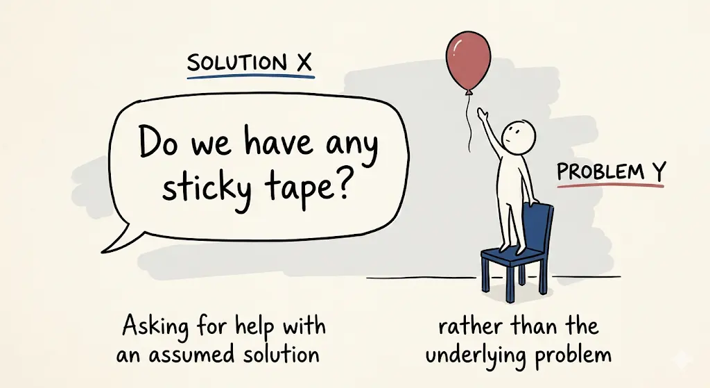
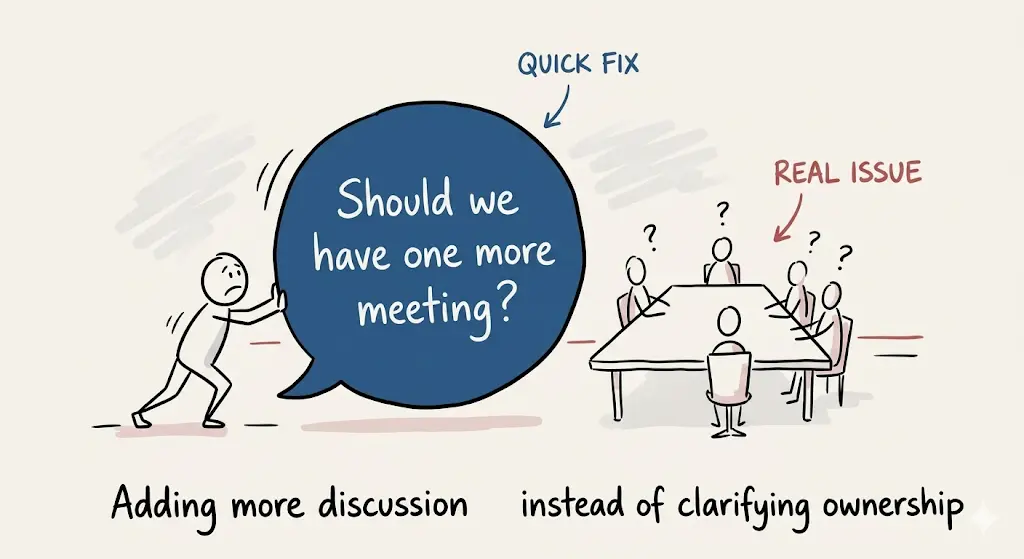
정보 과잉의 시대에 사람들은 딱딱한 격식체 보고서나 정형화된 컴퓨터 그래픽에 피로감을 느낍니다. 이때 친구가 노트 한구석에 슥슥 그려서 보여주는 듯한 “손글씨와 느슨한 잉크 펜 손그림(Hand-drawn Doodle)”은 보는 순간 마음의 방어벽을 허물고 핵심 메시지에 온전히 집중하게 만듭니다.
graph LR
    A[사용자의 골치 아픈 문제 고민] --> B["좌측: 비효율적인 일반 상황 풍자 스케치"]
    B --> C[캐릭터의 재치 있는 말풍선 독백]
    C --> D["우측: 본질을 꿰뚫는 핵심 돌파구 솔루션"]
    D --> E[따뜻한 공감과 즉각적인 깨달음 형성]
- 대화형 스토리텔링(Conversational Storytelling): 일방적인 설명 대신, 귀여운 스틱맨 캐릭터들이 말풍선을 주고받으며 독자의 고민을 대변합니다.
- 미니멀 플랫 컬러의 집중도: 화려한 그라데이션 대신 흑백 잉크 라인을 기본으로 하고, 한두 가지 파스텔 액센트 컬러만 사용하여 메시지의 본질을 부각시킵니다.
1. 레퍼런스 비주얼 정밀 역공학 (Deconstruction)
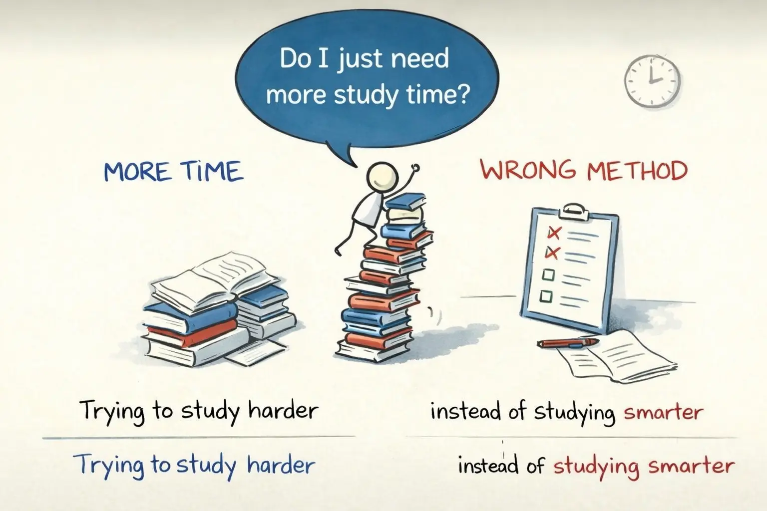
1-1. 시각 레이아웃 3대 구성 규칙
classDiagram
    class HandDrawnExplainer {
        +PaperBase: Warm off-white textured paper with slight deckle edge
        +InkLines: Loose, expressive black fountain-pen or fineliner ink strokes
        +ColorStyle: Minimal flat color accents (Warm Yellow, Pastel Sky Blue, Coral)
        +SplitComposition: Left (Struggle/Chaos) vs Right (Clarity/Breakthrough)
        +SpeechBubbles: Hand-lettered quirky dialogue bubbles
    }
- 따뜻한 종이 바탕(Warm Paper Base):
- 차가운 백색 스크린이 아니라, 은은한 미색(Warm off-white)의 고급 드로잉 종이 질감.
- 2분할 대조 구도(Problem vs Solution):
- 좌측 (The Struggle): 복잡하게 엉킨 실타래, 땀 흘리는 캐릭터, 좌절의 말풍선.
- 우측 (The Breakthrough): 정돈된 전구, 미소 짓는 캐릭터, 명쾌한 1줄 핵심 원리.
- 손글씨 느낌의 말풍선(Whimsical Speech Bubbles):
- 기계적인 고딕 서체가 아니라, 손으로 꾹꾹 눌러쓴 듯한 핸드 레터링(Hand-lettered text).
2. 기본 프롬프트 템플릿 및 핵심 키워드
| 속성 | 핵심 영문 프롬프트 키워드 | 비주얼 효과 |
|---|---|---|
| 화풍 및 도구 | hand-drawn whiteboard sketch, loose black ink lines, minimal flat colors |
잉크 펜으로 그린 듯한 자연스러운 손맛 |
| 캔버스 질감 | warm off-white paper background, tactile sketchbook paper texture |
따뜻하고 부드러운 스케치북 종이 질감 |
| 표현 양식 | charming stick figure doodle, hand-lettered speech bubble, before-and-after comparison |
유쾌한 캐릭터와 대화형 구성 |
3. 마스터 템플릿 및 즉시 복사 실전 프롬프트 3종
3-1. [케이스 1] 복잡한 문제 해결 방식 (레퍼런스 완벽 재현)
Create a conceptual hand-drawn whiteboard sketch illustration on a warm off-white paper background, with loose black ink lines, minimal flat colors, showing a before-and-after comparison about "Smart Problem Solving".

Left side depicts a chaotic scenario: a cute stick-figure developer drowning under a giant tangled ball of black yarn representing bugs, with a frustrated speech bubble saying "Where do I even begin?!".

Right side depicts the breakthrough solution: the same character calmly holding a pair of golden scissors to cut the core knot, with a glowing yellow lightbulb doodle overhead and a confident speech bubble: "Find the single root cause first!".

Whimsical doodle aesthetics, charming handwritten notes, inspiring educational social media graphic --ar 16:9 --style raw --v 6.1
3-2. [케이스 2] 효과적인 공부 방법 (단순 암기 vs 능동적 인출)
An insightful hand-drawn doodle illustration comparing "Passive Cramming vs Active Recall Study Methods" on a textured ivory sketchbook page. Left side: a tired student staring blankly at a massive textbook with colorful meaningless highlighter scribbles, feeling overwhelmed. Right side: the same student smiling while teaching a whiteboard to an attentive teddy bear, drawing simple mindmaps and self-testing flashcards. Warm pastel accents, friendly comic style, clear educational visual hierarchy --ar 16:9 --v 6.13-3. [케이스 3] 팀 커뮤니케이션과 사일로 극복
A humorous hand-drawn business sketchnote about "Breaking Team Silos in Product Development". Left: three separate brick towers labeled Dev, Design, and Biz with stick figures throwing paper airplanes at each other, resulting in misunderstandings. Right: the three figures happily sitting around a shared round coffee table, piecing together a jigsaw puzzle with green checkmarks. Black fineliner pen style with playful orange and teal accents, heartwarming team culture visual --ar 16:9 --v 6.14. 실무 활용 팁: 블로그와 SNS에서 인게이지먼트 높이기
- 공감대 형성 인트로에 배치:
- 블로그 글 서두에 이 손그림을 배치하면 독자는 “아, 나도 저런 적 있는데!”라는 깊은 감정적 공감을 느끼며 글 전체를 끝까지 읽게 됩니다.
- 글자 영역 투명화 후 한글 손글씨 폰트 합성:
- 이미지 생성 후 말풍선 내부를 지우고, 무료 상용 손글씨 폰트(온글잎, 카페24 단정해체 등)로 한국어 대사를 넣으면 친근감이 200% 배가됩니다.
Part 4. 실사 사진 위 감성 낙서(Doodle) 드로잉 합성
0. 일상을 동화로 바꾸는 ’하이브리드 미디어(Hybrid Media)’의 매력
스마트폰 갤러리에 가득 찬 일상 스냅샷이나 여행 사진을 독창적인 콘텐츠로 탈바꿈시키는 가장 감각적인 방법은 “실사 사진(Photorealism) 위에 아날로그 손그림 낙서(Hand-drawn Doodle)를 덧입히는 것”입니다. 인스타그램, 틱톡 등 SNS에서 수많은 공유를 이끌어내는 이 스타일은 감성적인 따뜻함과 위트를 동시에 선사합니다.
graph LR
    A[사용자의 원본 실사 사진] --> B["AI 비전 모델 정밀 분석: 구도 및 피사체 유지"]
    B --> C["손으로 그린 듯한 크레용/색연필 라인 스케치 합성"]
    C --> D["하늘/여백에 삐뚤빼뚤한 구름, 별, 하트 낙서 배치"]
    D --> E[감성적인 동화풍 하이브리드 포스터 완성]
- 극적인 질감 대비(Textural Contrast): 렌즈가 포착한 실사 인물의 자연스러운 피부톤과 바다의 파도 질감 위에 거친 크레용 선이 교차하면서 독특한 예술적 긴장감이 형성됩니다.
- 스토리텔링의 극대화: 사진 속 인물의 내면 심리나 보이지 않는 상상력을 귀여운 낙서 요소를 통해 직관적으로 시각화할 수 있습니다.
1. 레퍼런스 비포 & 애프터 정밀 분석
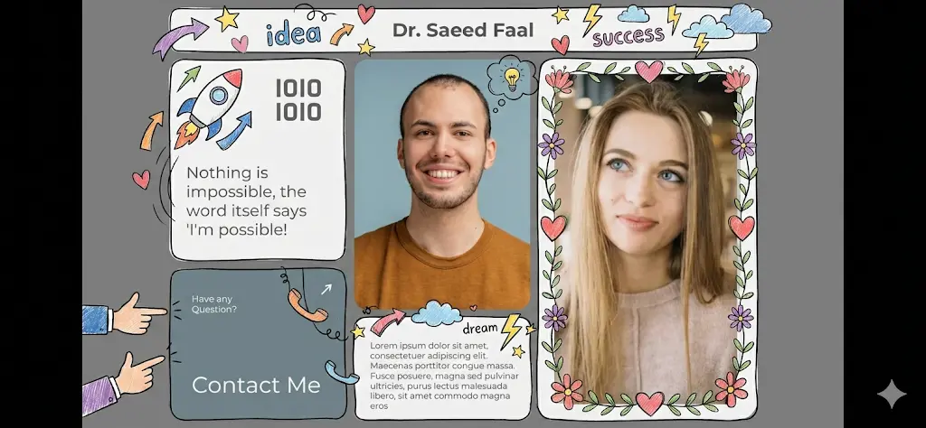
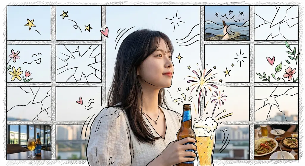
1-1. 드로잉 요소의 전략적 배치 원칙
classDiagram
    class DoodleComposition {
        +PreservedBase: Original photo lighting, skin tones, subject pose
        +BackgroundReplacement: Scenic background sketched with black pen lines
        +WhitespaceFillers: Clouds, stars, sparkles, cute arrows, floral scribbles
        +SubjectInteractions: Water splashes, halo doodle, heart floaties
        +TextureStyle: Colored pencil shading and crayon stroke imperfections
    }
- 원본 피사체 보존(Subject Preservation):
- 주인공(인물, 동물)의 얼굴 표정, 옷 색상, 피부 톤, 포즈는 AI가 임의로 왜곡하지 않고 100% 실사 그대로 유지해야 합니다.
- 배경의 스케치화(Background Stylization):
- 멀리 보이는 산, 건물, 절벽, 다리 등 거대한 풍경 요소를 굵은 검은색 펜 라이너와 거친 색연필 채색으로 대체합니다.
- 여백의 감성 낙서(Doodle Accents):
- 하늘이나 바다의 빈 여백에 삐뚤빼뚤한 구름, 별, 반짝임, 작은 음표, 식물 덩굴 낙서를 채워 동화적 무드를 연출합니다.
2. 핵심 프롬프트 파라미터 및 키워드 사전
| 카테고리 | 핵심 영문 프롬프트 키워드 | 시각적 특징 |
|---|---|---|
| 드로잉 기법 | hand-drawn crayon doodle overlay, rough colored pencil sketch, imperfect child-like line art |
기계적이지 않은 따뜻한 수작업 크레용/색연필 질감 |
| 피사체 유지 | keep the original photo subject completely photorealistic and untouched, preserve lighting and colors |
인물과 주요 피사체의 실사 정체성 엄격 보존 |
| 낙서 요소 | whimsical clouds, stars, floating hearts, hand-drawn sparkles, cute floral scribbles |
장난스럽고 사랑스러운 일러스트 오브젝트 |
| 전체 스타일 | hybrid photo-illustration poster, storybook aesthetic, nostalgic art direction |
실사와 드로잉이 조화된 감성 아트 포스터 |
3. 마스터 메타 프롬프트: AI 비서에게 지시하는 프롬프트 작성기
사진을 업로드할 수 있는 멀티모달 AI(ChatGPT 4o, Gemini 1.5 Pro, Claude 3.5 Sonnet)에 아래 명령을 입력하면, 업로드한 사진에 딱 맞는 생성 프롬프트를 자동으로 설계해 줍니다.
당신은 평범한 사진을 동화 속 한 장면처럼 연출하는 ‘비주얼 아트 디렉터’이자 ‘AI 프롬프트 엔지니어’입니다.

첨부된 이미지의 구도와 피사체를 정밀하게 분석하여, 이 사진과 완벽하게 어울리는 ‘핸드 드로잉 및 낙서(Doodle)’ 요소를 추가하기 위한 최적의 이미지 생성 프롬프트를 작성해 주세요.

[분석 및 작성 가이드]
1. Step 1 (배경/피사체 분석): 사진 속 인물의 동작과 주요 배경을 정확히 인식.
2. Step 2 (피사체 불변 원칙): 주인공의 얼굴, 복장, 원본 조명 분위기는 절대 변경하지 않고 실사로 보존.
3. Step 3 (스케치 치환): 원본의 거대 배경(절벽, 건물, 다리)을 검은색 펜 스케치와 색연필 질감으로 변환.
4. Step 4 (낙서 오버레이): 하늘과 피사체 주변 여백에 손으로 그린 듯한 삐뚤빼뚤 구름, 하트, 별, 식물 낙서 배치.

위 원칙을 반영하여, 이미지 생성 AI에 그대로 입력할 수 있는 [한글 및 영문 프롬프트 각 1개]를 출력하세요.
4. 즉시 복사 가능한 실전 생성 프롬프트 3종
4-1. [케이스 1] 바다 절벽 여행 스냅샷의 동화적 변환 (레퍼런스 완벽 재현)
A whimsical hybrid photo-illustration poster. Keep the original photograph's subject completely untouched and photorealistic: a smiling woman in a yellow swimsuit posing on the shore, the clear turquoise water, and people in the background remain true to the original lighting. Overlay hand-drawn colored pencil and crayon doodle elements onto the scene. Transform the distant cliff and massive rock arch into rough black pen contour sketches filled with textured colored pencil shading. Fill the open sky and negative space with charming hand-drawn imperfect clouds, soaring birds, twinkles, hearts, floating musical notes, and small flower scribbles. Add hand-drawn crayon ripples, tiny swimming fish doodles, and warm sunbeams over the sea. Nostalgic storybook poster aesthetic --ar 3:4 --v 6.14-2. [케이스 2] 도심 카페 데이트 스냅의 로맨틱 일러스트
A romantic hybrid photo-illustration artwork. Preserve the original photograph perfectly: a young couple sitting at an outdoor cafe table sipping iced lattes with natural afternoon sunlight and realistic depth of field. Overlay cute, child-like white and pastel-pink chalk doodles on top of the image. The cafe's brick wall and urban street background are overlaid with sketchy architectural outlines. Playful floating coffee beans, heart-shaped steam swirls rising from the cups, whimsical cat doodles sitting on the empty chair, and hand-drawn sparkle stars illuminate around the couple. Warm film tone, cozy emotional lifestyle branding --ar 4:5 --v 6.14-3. [케이스 3] 반려견 산책 사진의 위트 있는 낙서 효과
A joyful hybrid photo-and-doodle pet poster. The Golden Retriever running on the grassy lawn remains 100% photorealistic with crisp fur details and genuine daylight exposure. Surrounding the dog, overlay dynamic and playful hand-drawn colored crayon scribbles: a goofy hand-drawn cartoon crown floating over the dog's head, sketchy golden wings on its back, speed lines behind its paws, flying cartoon bone doodles, and cheerful blooming hand-sketched sunflowers covering the background lawn. High-energy, warmhearted, vibrant family photo aesthetic --ar 1:1 --v 6.15. 실무 후가공 및 플랫폼 배포 팁
- 포토샵 브러시 도구와의 시너지:
- AI가 생성한 드로잉 결과물에서 약간 아쉬운 부분이 있다면, 포토샵이나 프로크리에이트(Procreate)의 ‘크레용/연필 브러시’로 내 손글씨나 특별한 기념일 날짜를 1~2개 덧붙여 보세요. 세상에 단 하나뿐인 감성 아트워크가 완성됩니다.
- 소장용 엽서 및 굿즈 인쇄:
- 이 스타일은 디지털 화면뿐 아니라 랑데뷰(Rendezvous)나 반누보(Vannouveau) 같은 무광 텍스처 수입지에 인쇄할 때 손그림 특유의 아날로그 질감이 200% 살아나 굿즈 제작용으로 최상의 만족도를 제공합니다.
Part 5. 그림판 감성의 B급 낙서(Crappy Doodle) 드로잉
0. 완벽함에 지친 대중의 심리: ’하찮은 그림(Crappy Art)’의 역습
Midjourney, FLUX, Stable Diffusion 등 최신 생성형 AI 모델들은 8K 해상도, 극사실적 피부 질감, 완벽한 시네마틱 라이팅을 뽑아냅니다. 하지만 역설적으로 너무나 완벽하고 번지르르한 AI 이미지들은 대중에게 “AI로 찍어낸 피로감(AI Fatigue)”을 줍니다.
graph TD
    A[완벽한 8K 극실사 AI 이미지의 범람] -->|인공적인 느낌 & 시각적 피로| B[무감각한 스크롤 패스]
    C[의도된 초저퀄리티 B급 하찮은 낙서] -->|풋- 웃음을 자아내는 인간미| D["네티즌의 무장해제 & 공감"]
    D --> E["SNS 리트윗/댓글 폭발 및 밈(Meme) 바이럴"]
- 키치(Kitsch)와 인간미의 승리: 윈도우 95 그림판(MS Paint)에서 마우스로 덜덜 떨며 대충 그린 듯한 삐뚤빼뚤한 선, 짝짝이 눈, 어설픈 색칠은 보는 이로 하여금 폭소를 자아내며 강력한 심리적 친밀감을 형성합니다.
- 마케팅에서의 반전 효과: 진지하고 어려운 기술 주제나 기업 홍보물을 ’하찮은 그림체’로 설명할 때 독자의 방어기제가 순식간에 무너지며 전달력이 극대화됩니다.
1. 하찮은 낙서 스타일의 시각적 문법 해체 (Deconstruction)
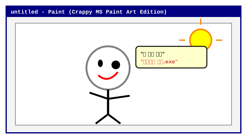
1-1. ‘제대로 하찮게’ 그리기 위한 5대 역설적 법칙
classDiagram
    class CrappyDoodleGrammar {
        +Canvas: Pure flat stark white background (#FFFFFF)
        +ToolMetaphor: Drawn with optical ball mouse in Windows Paintbrush
        +Lines: Shaky, wobbly, pixelated black strokes with varying width
        +Coloring: Crudely filled with paint bucket tool, leaking outside lines
        +Anatomy: Asymmetrical googly eyes, stick limbs, derpy facial expressions
        +Attitude: "야 됐고 그냥 니 맘대로 그려" 무심한 자유분방함
    }
- 캔버스 환경: 화려한 조명이나 그라데이션을 완전히 배제한 순백색(#FFFFFF) 평면 배경.
- 마우스 궤적의 떨림(Jittering Stroke):
- 타블렛 펜의 미려한 필압이 아니라, 1990년대 볼마우스로 덜덜 떨며 그린 듯한 삐뚤빼뚤하고 각진 픽셀 선(Wobbly pixelated lines).
- 해부학적 무시(Derpy Anatomy):
- 한쪽 눈은 크고 한쪽 눈은 점 하나로 찍힌 짝짝이 눈, 몸통에 대충 붙어있는 막대기 팔다리(Stick figure).
- 엉성한 페인트 통 채색(Leaky Bucket Fill):
- 외곽선이 덜 닫혀서 색상이 바깥으로 삐져나오거나, 테두리 안쪽에 흰색 틈새가 허술하게 남아있는 감성.
2. 하찮음 이미지 프롬프트 핵심 키워드 사전
| 속성 영역 | 핵심 영문/한글 프롬프트 키워드 | 비주얼 효과 |
|---|---|---|
| 도구 메타포 | drawn in MS Paint with a mouse, Windows 95 paintbrush tool |
마우스로 서툴게 그린 특유의 엉성함 |
| 선화 스타일 | wobbly shaky pixelated lines, crappy low-effort doodle, derpy scribbles |
삐뚤빼뚤하고 덜덜 떨리는 선 표현 |
| 인체/형태 | anatomically incorrect, googly mismatched eyes, stick figure anatomy |
바보 같으면서도 귀여운 캐릭터 외형 |
| 채색 기법 | sloppy flat bucket fill, color leaking outside borders, stark white void |
대충 쏟아부은 듯한 허술한 단색 채색 |
3. 원본 1줄 프롬프트의 재해석 및 마스터 템플릿
사용자가 메모장에 남겨둔 날것의 명령어를 살펴보면 놀라운 프롬프트 엔지니어링 통찰이 담겨 있습니다:
“첨부한 이미지를 개발새발 세상에서 제일 하찮은 선으로 그려줘. 배경은 흰색, 그림판에서 마우스로 그린 것 같은 맞는 듯 아닌 듯 비슷한 듯 아닌 듯 아리까리하게 픽셀 단위의 그림으로 하찮음을 제대로 뽐내줘. 야 됐고 그냥 니 맘대로 그려.”
이 문장을 최신 AI 모델(ChatGPT DALL-E 3, Midjourney v6)이 완벽히 실행할 수 있는 정밀 프롬프트 템플릿으로 구조화하면 다음과 같습니다:
당신은 세상에서 그림을 가장 하찮고 엉성하게 그리는 1990년대 B급 웹툰 작가입니다.
아래 [대상/사진]을 분석하여, 완벽함을 완전히 버리고 극도의 하찮음을 뽐내는 일러스트 프롬프트를 작성하세요.

[규칙]
1. 완벽한 비율, 멋진 렌더링, 입체 음영 절대 금지.
2. MS 그림판에서 마우스로 덜덜 떨며 그린 것 같은 삐뚤빼뚤한 검은색 픽셀 외곽선.
3. 양쪽 크기가 전혀 다른 짝짝이 눈, 멍청하고 억울해 보이는 입모양.
4. 배경은 순백색, 채색은 페인트 통으로 대충 들이부은 단색 원색.
5. 보는 사람이 헛웃음이 터질 만큼 하찮고 귀여운 밈(Meme) 무드 연출.

[대상/사진]: {여기에 변환하고 싶은 피사체를 적으세요}
4. 즉시 복사 가능한 실전 생성 프롬프트 3종
4-1. [케이스 1] 억울하고 하찮은 고양이 밈 (Crappy Derpy Cat)
The crappiest and most low-effort funny MS Paint drawing of a cat you have ever seen. Drawn with a computer mouse in Windows 95 Paint on a stark pure white background (#FFFFFF). Incredibly wobbly, shaky, jagged black pixel outline with uneven thickness. The cat has mismatched derpy eyes (one large circle, one tiny dot), an asymmetrical crooked mouth, and tiny stick-figure legs. Flat orange tabby color crudely filled with digital paint bucket leaving uncolored white gaps near the borders. Absolutely zero shading, zero gradients, delightfully terrible artwork, viral internet meme aesthetic --ar 1:1 --style raw --v 6.14-2. [케이스 2] 출근길 직장인의 영혼 없는 표정 (Tired Office Worker)
A comically terrible and intentionally poorly drawn stick figure illustration of an exhausted office worker at a desk. Drawn clumsily using MS Paint pencil tool with wobbly lines. The person has dead spiral eyes, a wavy frown line, and three hairs on the head. A crude boxy computer monitor with a scribbled pie chart. Pure white background, zero artistic skill, funny relatable adult burnout humor, MS Paint doodle masterpiece --ar 4:3 --v 6.14-3. [케이스 3] 사나운 호랑이를 하찮은 줄무늬 찹쌀떡으로 변환
An absurdly low-effort, hilarious child-like scribble of a ferocious tiger. It looks like a lumpy orange potato with jagged black sharpie stripes drawn by a 5-year-old on blank white printer paper. Derpy cross-eyed expression, a tiny tongue sticking out sideways, stick legs that can barely support its body. Bright crayon yellow teeth, pure white background, charmingly pathetic and cute, peak internet humor --ar 1:1 --v 6.15. SNS 바이럴 마케팅 및 브랜드 적용 팁
- 인스타그램 릴스 & 카드뉴스 도입부:
- 카드뉴스의 1페이지에 화려한 그래픽 대신 이 하찮은 그림을 배치하고 “오늘 배울 내용 요약 (진짜임)” 같은 카피를 붙이면 클릭률이 300% 이상 폭증합니다.
- 사내 슬랙(Slack) 커스텀 이모지 & 굿즈:
- 사내 메신저나 커뮤니티에서 동료들의 공감을 얻는 커스텀 스티커, 티셔츠, 키링 굿즈로 제작하면 폭발적인 소장 욕구를 자극합니다.
참고문헌 및 권위 출처
- Rohde, M. (2012). The Sketchnote Handbook: The Illustrated Guide to Visual Note Taking. Peachpit Press. https://rohdesign.com/handbook
- Sweller, J. (1988). Cognitive load during problem solving: Effects on learning. Cognitive Science, 12(2), 257-285. https://doi.org/10.1207/s15516709cog1202_4
- Roam, D. (2008). The Back of the Napkin: Solving Problems and Selling Ideas with Pictures. Portfolio / Penguin. https://www.danroam.com/