0. 제안서의 승패를 가르는 ‘극적인 시각적 전후(Before & After)’ 대조
경영진 보고, 정부 과제 제안서, 스타트업 투자 유치 IR 덱에서 심사위원의 마음을 움직이는 가장 결정적인 장표는 “도입 전(AS-IS)의 고통과 문제점”과 “도입 후(TO-BE)의 눈부신 혁신과 가치”를 비교하는 슬라이드입니다. 글자로만 적힌 표는 감정적 변화를 이끌어내지 못하지만, 시각적 은유가 가미된 3D AS-IS / TO-BE 인포그래픽은 단 3초 만에 사업의 필요성을 납득시킵니다.
graph LR
    subgraph AS_IS [좌측: AS-IS 레거시 현황]
        A1[수작업 서류 더미 & 분절된 사일로]
        A2[붉은 경고등, 얽힌 배선, 칙칙한 회색 톤]
        A3[비효율과 병목 현상의 시각화]
    end
    subgraph Transition [중앙: 디지털 전환 브릿지]
        T[전환 화살표 & AI 지능형 코어 도입]
    end
    subgraph TO_BE [우측: TO-BE 혁신 청사진]
        B1[클라우드 통합 대시보드 & 자동화 파이프라인]
        B2[청량한 에메랄드/블루, 정돈된 모듈, 밝은 햇살]
        B3[비용 절감과 초격차 생산성 달성]
    end
AS_IS --> Transition --> TO_BE- 극적인 채도와 조명의 대비: 좌측 AS-IS는 어둡고 탁한 콘크리트 그레이와 붉은색 경고등으로 답답함을 연출하고, 우측 TO-BE는 화사한 웜화이트와 싱그러운 에메랄드/블루로 해방감을 줍니다.
- 공간 정돈(Spatial Order)의 메타포: 어지럽게 널브러진 서류와 꼬인 전선이 우측에서는 깔끔한 유리 선반과 발광 파이프라인으로 매끄럽게 정렬됩니다.
1. 레퍼런스 비주얼 정밀 분석 (Deconstruction)
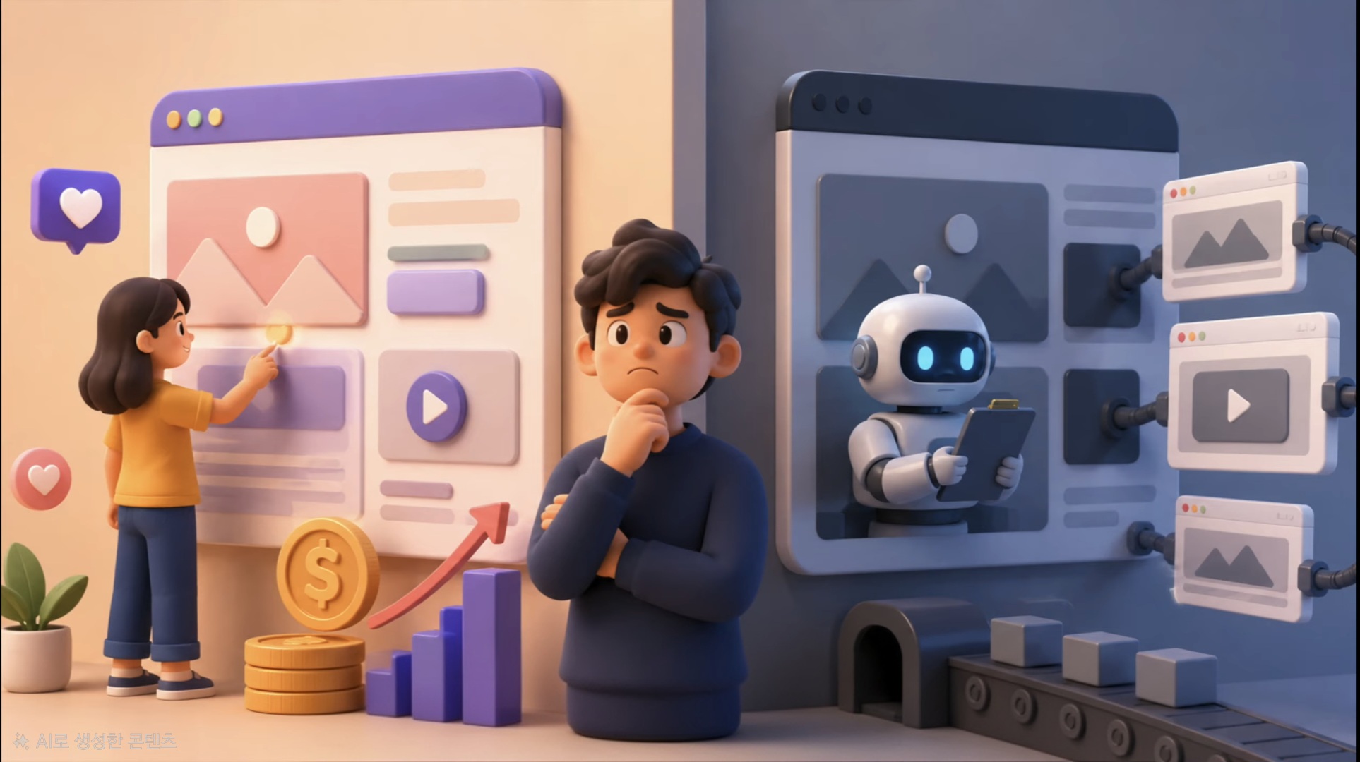
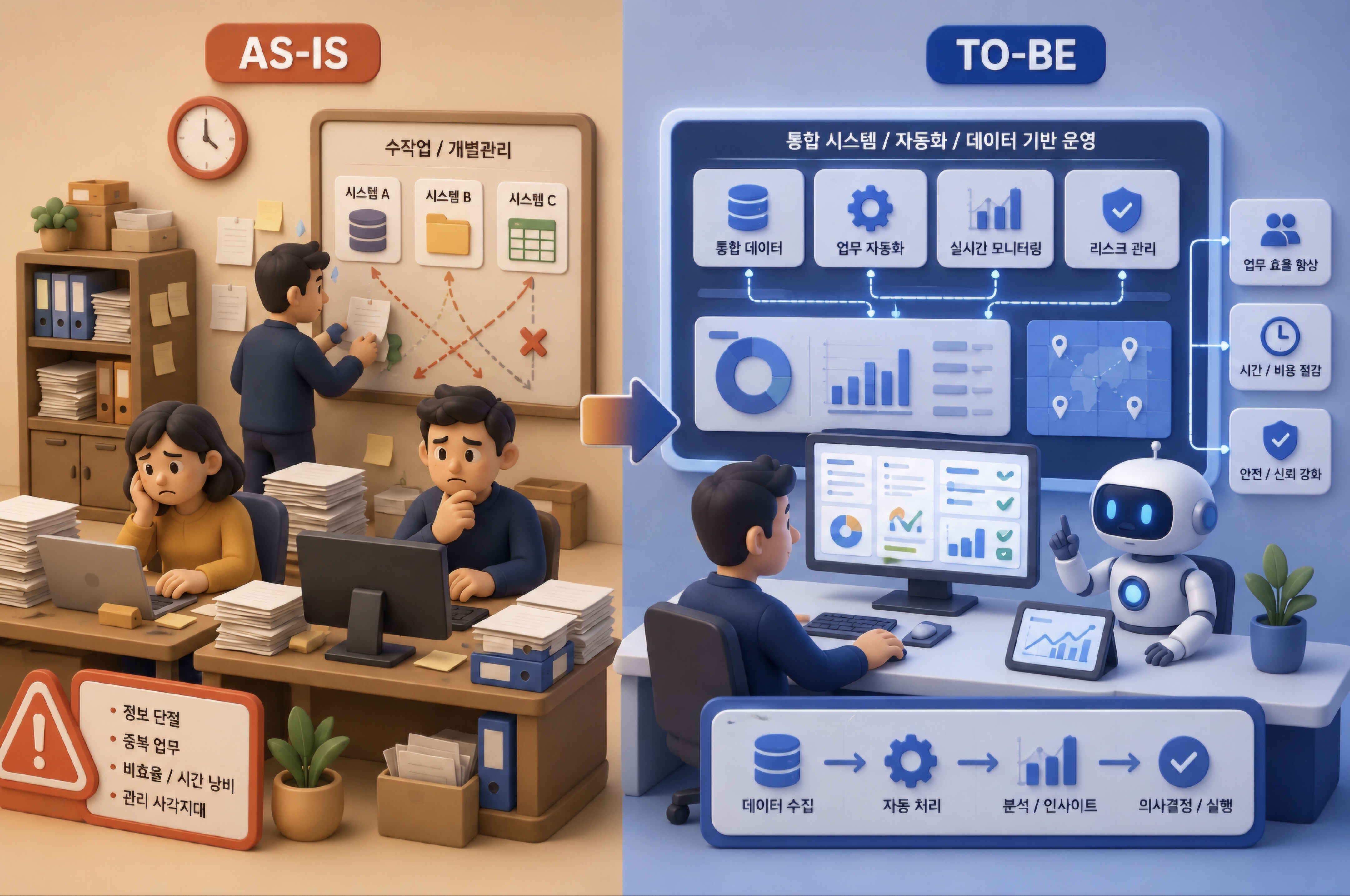
1-1. 16:9 화면 분할 구도 및 인지 법칙
classDiagram
    class AsIsToBeComposition {
        +AspectRatio: 16:9 Widescreen Landscape
        +Divider: Subtle glowing vertical boundary line or curved trajectory arrow
        +Left_AsIs: 45% Width / Cluttered, desaturated, red warning alerts, manual bottleneck
        +Center_Bridge: 10% Width / Dynamic transition arrow or digital portal
        +Right_ToBe: 45% Width / Pristine ivory, glowing cyan pipelines, modular glass dashboards
}- 좌측 (AS-IS): 고통의 가시화:
- 채도가 빠진 차콜 그레이 톤.
- 무질서하게 쌓인 종이 서류, 수동 도장, 분절된 낡은 서버 타워, 스파게티처럼 얽힌 전선.
- 중앙 (The Transformation Pivot):
- 좌측에서 우측으로 에너지가 흐르는 우아한 3D 네온 화살표 또는 디지털 게이트웨이.
- 우측 (TO-BE): 이상의 실현:
- 완벽하게 정렬된 클라우드 글래스모피즘 모듈, 투명한 태블릿 인터페이스, 한 번의 클릭으로 완료되는 자동화 승인 루프.
2. 핵심 프롬프트 파라미터 및 키워드 사전
| 비교 축 | AS-IS 필수 키워드 | TO-BE 필수 키워드 |
|---|---|---|
| 분위기 & 톤 | cluttered, messy, desaturated gray tone, gloomy dim lighting |
pristine, organized, bright luminous lighting, vibrant cyan accents |
| 물리적 상태 | overflowing paper documents, tangled cables, fragmented silos |
streamlined glassmorphic UI, glowing modular pipelines, automated flow |
| 감정적 신호 | inefficiency, bottleneck, red warning indicators |
effortless efficiency, real-time intelligence, emerald green success |
| 전체 구도 | 16:9 split-screen comparison infographic, left AS-IS versus right TO-BE |
dramatic side-by-side juxtaposition, transformation arrow |
3. 마스터 메타 프롬프트 템플릿
당신은 맥킨지/BCG 수준의 글로벌 전략 컨설팅 펌 프레젠테이션 수석 비주얼 디렉터입니다.
아래 [혁신 과제]를 바탕으로, Midjourney v6.1에 입력할 완벽한 [AS-IS vs TO-BE 3D 비교 인포그래픽 영문 프롬프트 1개]를 작성하세요.

[필수 요건]
1. 화면비: 16:9 와이드스크린, 좌우 5:5 완벽한 대비 구도.
2. 좌측(AS-IS): 수작업, 단절, 얽힌 케이블, 칙칙한 조명, 빨간 경고 신호로 문제점 극대화.
3. 우측(TO-BE): 클라우드, 통합 자동화, 정돈된 모듈, 밝은 스튜디오 조명, 청록색 발광 라인으로 혁신 극대화.
4. 중앙 연결: 좌에서 우로 자연스럽게 흐르는 3D 전환 벡터 흐름.

[혁신 과제]: {여기에 개선할 비즈니스, 행정, 데이터 시스템 주제를 적으세요}
4. 즉시 복사 가능한 실전 생성 프롬프트 2종
4-1. [케이스 1] 공공 행정 문서 결재의 디지털 혁신 (레퍼런스 완벽 재현)
A stunning 16:9 split-screen 3D comparison infographic illustrating Digital Transformation from AS-IS to TO-BE. LEFT HALF (AS-IS): A dimly lit, cluttered office space with overflowing paper binders, manual red rubber stamps, tangled black wires, and sluggish hourglass icons in desaturated gray tones. RIGHT HALF (TO-BE): A sunlit, pristine enterprise tech environment featuring sleek floating glassmorphic tablet dashboards, automated green checkmarks, and glowing cyan data pipelines seamlessly connecting modules. A dynamic, luminous 3D transformation arrow flows from left to right across the center seam. Hyper-detailed claymorphism aesthetic, studio depth of field, presentation ready --ar 16:9 --style raw --v 6.14-2. [케이스 2] 제조업 스마트 팩토리 품질 검사 공정의 진화
A powerful side-by-side 3D technological comparison poster. LEFT: Traditional factory floor showing weary workers manually inspecting parts with calipers under harsh yellow sodium lights, defect boxes piling up in chaotic shadows. RIGHT: Fully automated smart factory line where high-speed AI robotic cameras scan products with precision laser light sheets, defect-free green indicators, and real-time cloud telemetry. Studio-grade octane render, crisp negative space, stark contrast of old legacy vs intelligent future --ar 16:9 --v 6.15. 실무 발표 및 보고서 배치 팁
- ’Before’에 시선이 오래 머물지 않게 연출:
- 인간의 시선은 본능적으로 밝고 채도가 높은 곳으로 향합니다. 좌측 AS-IS의 명도를 의도적으로 낮추고 우측 TO-BE의 광량을 높이면, 청중은 자연스럽게 회사가 나아갈 미래 청사진에 압도적인 긍정적 확신을 갖게 됩니다.
- 정량적 수치 뱃지 결합:
- 우측 TO-BE 상단 여백에 “처리 시간 85% 단축”, “비용 40% 절감”과 같은 정량적 성과 지표(ROI)를 큰 글씨로 얹으면 제안서의 설득력이 정점에 달합니다.