0. 과학과 예술의 만남: 시네마틱 과학 해설(Scientific Explainer)
기후 변화 시뮬레이션, 양자 컴퓨터 연산 파이프라인, 위성 재난 관제 시스템 등 고도로 복잡한 과학 기술 데이터를 대중과 의사결정자에게 전달하는 것은 대단히 어렵습니다. 이때 헐리우드 SF 영화의 관제 센터나 내셔널지오그래픽 다큐멘터리에서 사용하는 ‘프리미엄 다크 테크 프로세스 인포그래픽’은 시각적 경외감을 불러일으킵니다.
graph LR
    A[원시 환경 데이터 / 위성 센서] -->|좌측 Step 1: 관측 및 수집| B[AI 분석 허브: 시뮬레이션 모델링]
    B -->|중앙 Step 2: 예측 및 머신러닝| C[위험 탐지 및 자동 대응]
C -->|우측 Step 3: 실시간 방재 및 결과 출력| D[완벽한 좌->우 파이프라인 완성]- 다크 모드의 압도적 명암비: 칠흑 같은 미드나잇 블루 배경 위에 데이터 경로를 네온 시안과 마젠타로 발광시켜, 빛나는 노드에 관람자의 시선을 100% 가둡니다.
- 좌에서 우로 흐르는 서사적 위계(Left-to-Right Narrative): 인간의 독서 방향에 맞춰 ’입력 $ ightarrow$ 처리 $ ightarrow$ 결과’가 물 흐르듯 자연스럽게 인지됩니다.
1. 레퍼런스 비주얼 정밀 역공학 (Deconstruction)
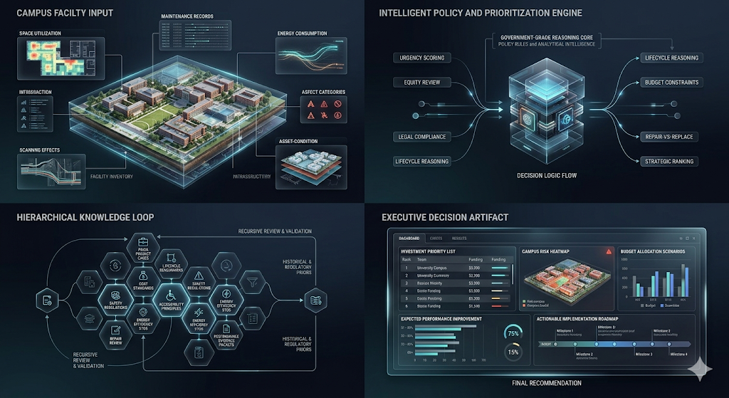
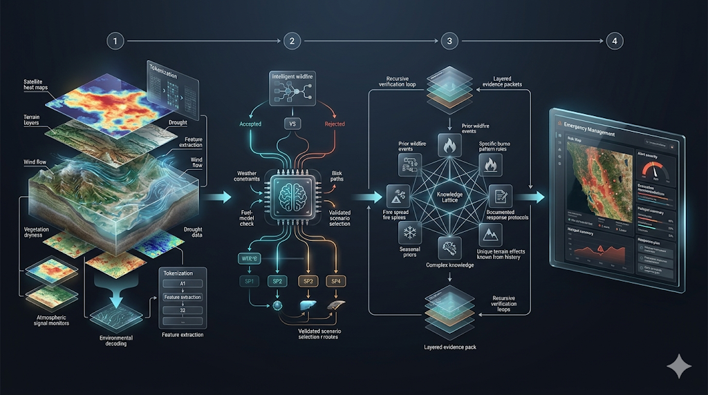
1-1. 시각적 구조 및 파이프라인 레이아웃
classDiagram
    class DarkTechPipeline {
        +Canvas: Deep Midnight Navy to Charcoal Gradient
        +FlowDirection: Left-to-Right Step-by-Step Reasoning
        +Module1_Input: Satellite Radar / Sensor Nodes
        +Module2_Process: Glowing 3D Earth Globe / Neural Heatmap
        +Module3_Output: Mission Control Dashboard / Risk Metrics
        +Connectors: Luminous energy streams and optic data ribbons
}- 캔버스 무드(Atmosphere):
- 짙은 미드나잇 네이비(Midnight Navy)와 흑연 차콜 톤의 고급스러운 비네팅 배경.
- 공기 중에 은은하게 떠다니는 발광 데이터 입자(Floating luminous particles).
- 핵심 모듈의 입체적 배치(3D Modules):
- 좌측: 원시 센서 관측 모듈(위성 레이더, 기상 관측 타워).
- 중앙: 빛나는 3D 지구 홀로그램 구체 또는 신경망 히트맵.
- 우측: 정밀한 지휘 통제(Command Control) 대시보드 및 리스크 평가 차트.
- 발광 커넥터(Luminous Connectors):
- 모듈 사이를 가로지르는 얇고 우아한 발광 리본과 광섬유 레이저 빔이 데이터의 흐름을 역동적으로 유도합니다.
2. 핵심 프롬프트 파라미터 및 키워드 사전
| 속성 분류 | 핵심 영문 프롬프트 키워드 | 비주얼 효과 |
|---|---|---|
| 배경 및 분위기 | deep dark navy backdrop, cinematic scientific explainer, subtle atmospheric volumetric glow |
영화적 몰입감을 부여하는 깊은 암부 |
| 파이프라인 흐름 | left-to-right multi-step reasoning pipeline, sequential workflow layout, ordered progression |
직관적인 인지 흐름을 따르는 단계별 전개 |
| 발광 시각 요소 | luminous cyan data ribbons, holographic 3D earth globe, translucent glowing micro-dashboards |
빛을 발산하는 미래형 데이터 모듈 |
| 렌더링 완성도 | presentation-ready enterprise tech infographic, hyper-detailed scientific visualization, 8k |
최고급 과학 저널 표지 수준의 디테일 |
3. 최종 핵심 마스터 프롬프트 템플릿
Design an ultra-premium cinematic scientific explainer image for [TOPIC], presented as a sophisticated left-to-right multi-step reasoning pipeline on a deep dark navy backdrop. The composition is divided into 3 to 4 sequential stages connected by luminous data ribbons and optical light pulses.

Stage 1 (Left): [입력 데이터 및 관측 장비 설명: 예: raw telemetry sensors and satellite radars].
Stage 2 (Center): [핵심 분석 및 AI 모델링 설명: 예: a glowing holographic 3D globe with interactive risk heatmaps].
Stage 3 (Right): [최종 분석 결과 및 제어 대시보드 설명: 예: precision analytics dashboard with decision metrics].

Clean typography, modular glassmorphic interface panels, soft volumetric atmospheric fog, pristine negative space around edges, award-winning scientific journal infographic aesthetic, 8k resolution --ar 16:9 --style raw --v 6.1
4. 즉시 복사 가능한 실전 생성 프롬프트 2종
4-1. [케이스 1] 기후 위기 및 산불 재난 실시간 조기 경보 파이프라인 (레퍼런스 완벽 재현)
Design an ultra-premium cinematic scientific explainer image for Wildfire Disaster Early Warning System, presented as a sophisticated left-to-right multi-step reasoning pipeline on a deep dark midnight-blue backdrop. The composition flows sequentially through three stages: On the left, satellite thermal cameras and IoT environmental sensor towers capturing real-time forest heat signatures; In the center, a stunning glowing 3D holographic terrain map with predictive AI flame spread vectors and wind dynamic ribbons; On the right, an advanced emergency dispatch command interface displaying evacuation routes and risk priority scores. Luminous cyan and amber data streams interconnecting each stage, volumetric studio lighting, photorealistic scientific render, pristine enterprise visual, 8k --ar 16:9 --style raw --v 6.14-2. [케이스 2] 차세대 금융 이상 거래 탐지(FDS) 및 실시간 블록체인 추적
A futuristic enterprise fintech infographic visualizing Real-time Fraud Detection Pipeline in a left-to-right cinematic workflow on an ultra-dark navy canvas. Left: Global banking transaction nodes emitting high-speed encrypted data packets. Center: A spinning translucent crystalline AI neural core analyzing behavioral patterns with neon-purple decision boundaries. Right: Instant automated risk mitigation lock and verified blockchain audit ledger panel. Razor-sharp holographic UI elements, vibrant electric blue and emerald glows, minimal clutter, boardroom keynote quality --ar 16:9 --v 6.15. 실무 발표 및 대형 화면 디스플레이 최적화 팁
- LED 월(Wall) 및 대형 모니터 전시:
- 다크 테마 인포그래픽은 대형 전시장 모니터나 LED 디스플레이에서 압도적인 존재감을 발휘합니다. 검은색 픽셀이 꺼지는 OLED 스크린에서는 배터리 소모를 줄이고 명암비를 극대화할 수 있습니다.
- 세부 텍스트 가독성 확보:
- 다크 배경에서는 흰색 텍스트가 번져 보일 수 있으므로(Halation 현상), 텍스트 레이블을 추가할 때는 순백색보다는 옅은 시안 그레이(#E0F2F1) 폰트 컬러를 사용하는 것이 가독성에 유리합니다.