0. 왜 격식 있는 다이어그램보다 ’손글씨 손그림’에 끌리는가?
정보 과잉의 시대에 사람들은 딱딱한 격식체 보고서나 정형화된 컴퓨터 그래픽에 피로감을 느낍니다. 이때 친구가 노트 한구석에 슥슥 그려서 보여주는 듯한 “손글씨와 느슨한 잉크 펜 손그림(Hand-drawn Doodle)”은 보는 순간 마음의 방어벽을 허물고 핵심 메시지에 온전히 집중하게 만듭니다.
graph LR
    A[사용자의 골치 아픈 문제 고민] --> B[좌측: 비효율적인 일반 상황 풍자 스케치]
    B --> C[캐릭터의 재치 있는 말풍선 독백]
    C --> D[우측: 본질을 꿰뚫는 핵심 돌파구 솔루션]
D --> E[따뜻한 공감과 즉각적인 깨달음 형성]- 대화형 스토리텔링(Conversational Storytelling): 일방적인 설명 대신, 귀여운 스틱맨 캐릭터들이 말풍선을 주고받으며 독자의 고민을 대변합니다.
- 미니멀 플랫 컬러의 집중도: 화려한 그라데이션 대신 흑백 잉크 라인을 기본으로 하고, 한두 가지 파스텔 액센트 컬러만 사용하여 메시지의 본질을 부각시킵니다.
1. 레퍼런스 비주얼 정밀 역공학 (Deconstruction)
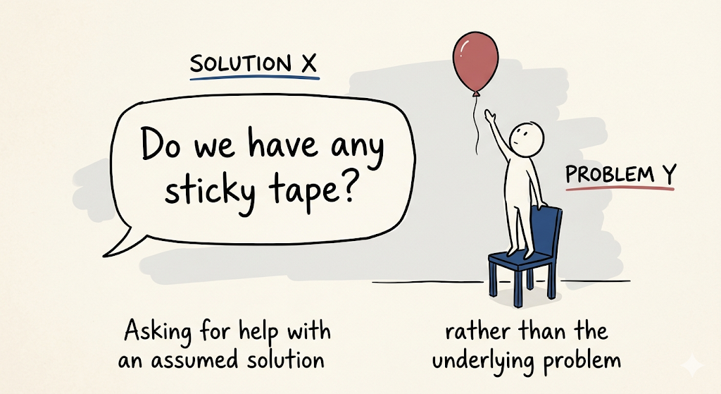
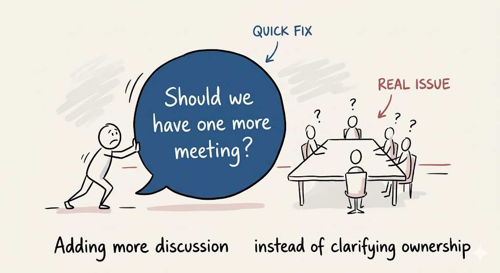
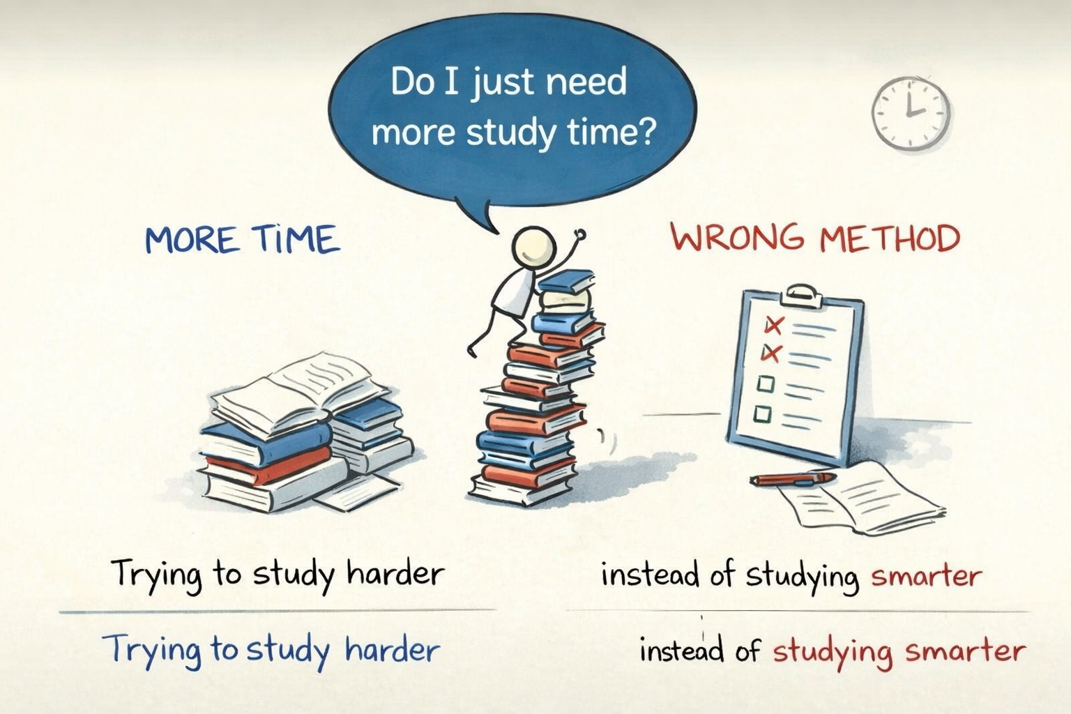
1-1. 시각 레이아웃 3대 구성 규칙
classDiagram
    class HandDrawnExplainer {
        +PaperBase: Warm off-white textured paper with slight deckle edge
        +InkLines: Loose, expressive black fountain-pen or fineliner ink strokes
        +ColorStyle: Minimal flat color accents (Warm Yellow, Pastel Sky Blue, Coral)
        +SplitComposition: Left (Struggle/Chaos) vs Right (Clarity/Breakthrough)
        +SpeechBubbles: Hand-lettered quirky dialogue bubbles
}- 따뜻한 종이 바탕(Warm Paper Base):
- 차가운 백색 스크린이 아니라, 은은한 미색(Warm off-white)의 고급 드로잉 종이 질감.
- 2분할 대조 구도(Problem vs Solution):
- 좌측 (The Struggle): 복잡하게 엉킨 실타래, 땀 흘리는 캐릭터, 좌절의 말풍선.
- 우측 (The Breakthrough): 정돈된 전구, 미소 짓는 캐릭터, 명쾌한 1줄 핵심 원리.
- 손글씨 느낌의 말풍선(Whimsical Speech Bubbles):
- 기계적인 고딕 서체가 아니라, 손으로 꾹꾹 눌러쓴 듯한 핸드 레터링(Hand-lettered text).
2. 기본 프롬프트 템플릿 및 핵심 키워드
| 속성 | 핵심 영문 프롬프트 키워드 | 비주얼 효과 |
|---|---|---|
| 화풍 및 도구 | hand-drawn whiteboard sketch, loose black ink lines, minimal flat colors |
잉크 펜으로 그린 듯한 자연스러운 손맛 |
| 캔버스 질감 | warm off-white paper background, tactile sketchbook paper texture |
따뜻하고 부드러운 스케치북 종이 질감 |
| 표현 양식 | charming stick figure doodle, hand-lettered speech bubble, before-and-after comparison |
유쾌한 캐릭터와 대화형 구성 |
3. 마스터 템플릿 및 즉시 복사 실전 프롬프트 3종
3-1. [케이스 1] 복잡한 문제 해결 방식 (레퍼런스 완벽 재현)
Create a conceptual hand-drawn whiteboard sketch illustration on a warm off-white paper background, with loose black ink lines, minimal flat colors, showing a before-and-after comparison about "Smart Problem Solving".

Left side depicts a chaotic scenario: a cute stick-figure developer drowning under a giant tangled ball of black yarn representing bugs, with a frustrated speech bubble saying "Where do I even begin?!".

Right side depicts the breakthrough solution: the same character calmly holding a pair of golden scissors to cut the core knot, with a glowing yellow lightbulb doodle overhead and a confident speech bubble: "Find the single root cause first!".

Whimsical doodle aesthetics, charming handwritten notes, inspiring educational social media graphic --ar 16:9 --style raw --v 6.1
3-2. [케이스 2] 효과적인 공부 방법 (단순 암기 vs 능동적 인출)
An insightful hand-drawn doodle illustration comparing "Passive Cramming vs Active Recall Study Methods" on a textured ivory sketchbook page. Left side: a tired student staring blankly at a massive textbook with colorful meaningless highlighter scribbles, feeling overwhelmed. Right side: the same student smiling while teaching a whiteboard to an attentive teddy bear, drawing simple mindmaps and self-testing flashcards. Warm pastel accents, friendly comic style, clear educational visual hierarchy --ar 16:9 --v 6.13-3. [케이스 3] 팀 커뮤니케이션과 사일로 극복
A humorous hand-drawn business sketchnote about "Breaking Team Silos in Product Development". Left: three separate brick towers labeled Dev, Design, and Biz with stick figures throwing paper airplanes at each other, resulting in misunderstandings. Right: the three figures happily sitting around a shared round coffee table, piecing together a jigsaw puzzle with green checkmarks. Black fineliner pen style with playful orange and teal accents, heartwarming team culture visual --ar 16:9 --v 6.14. 실무 활용 팁: 블로그와 SNS에서 인게이지먼트 높이기
- 공감대 형성 인트로에 배치:
- 블로그 글 서두에 이 손그림을 배치하면 독자는 “아, 나도 저런 적 있는데!”라는 깊은 감정적 공감을 느끼며 글 전체를 끝까지 읽게 됩니다.
- 글자 영역 투명화 후 한글 손글씨 폰트 합성:
- 이미지 생성 후 말풍선 내부를 지우고, 무료 상용 손글씨 폰트(온글잎, 카페24 단정해체 등)로 한국어 대사를 넣으면 친근감이 200% 배가됩니다.