0. 왜 차가운 도표 대신 ’화이트보드 스케치노트(Sketchnote)’인가?
사람들은 완벽하게 정돈된 컴퓨터 그래픽 도표보다, “전문가가 화이트보드 앞에서 마커를 쥐고 열정적으로 그려준 듯한 친근한 스케치노트”에 훨씬 더 깊은 신뢰와 몰입을 느낍니다. 스케치노트는 글자와 그림, 화살표, 강조 스티커가 유기적으로 어우러져 두뇌의 좌뇌(텍스트)와 우뇌(이미지)를 동시에 자극하는 최고의 학습 도구입니다.
graph TD
    A[복잡한 비교 대상 3종] --> B[1단계: 텍스트 핵심 요점 및 대비 구조화]
    B --> C[2단계: 화이트보드 마커펜 스케치노트 이미지 렌더링]
    C --> D[3단 종대 비교 레이아웃: 옵션 A vs B vs C]
D --> E[형광펜 하이라이트 & 손그림 화살표로 직관적 학습 완료]- 인지 부하의 획기적 분산: 어려운 기술 용어를 아기자기한 마커 손그림 아이콘으로 치환하여 초보자도 거부감 없이 접근할 수 있습니다.
- 3단 비교(3-Tier Comparison)의 명쾌함: ’기존 방식(과거) $ ightarrow$ 과도기적 대안(현재) $ ightarrow$ 궁극의 해결책(미래)’의 3단 구조로 솔루션의 우월성을 명확히 입증합니다.
1. 레퍼런스 비주얼 정밀 분석 (Deconstruction)
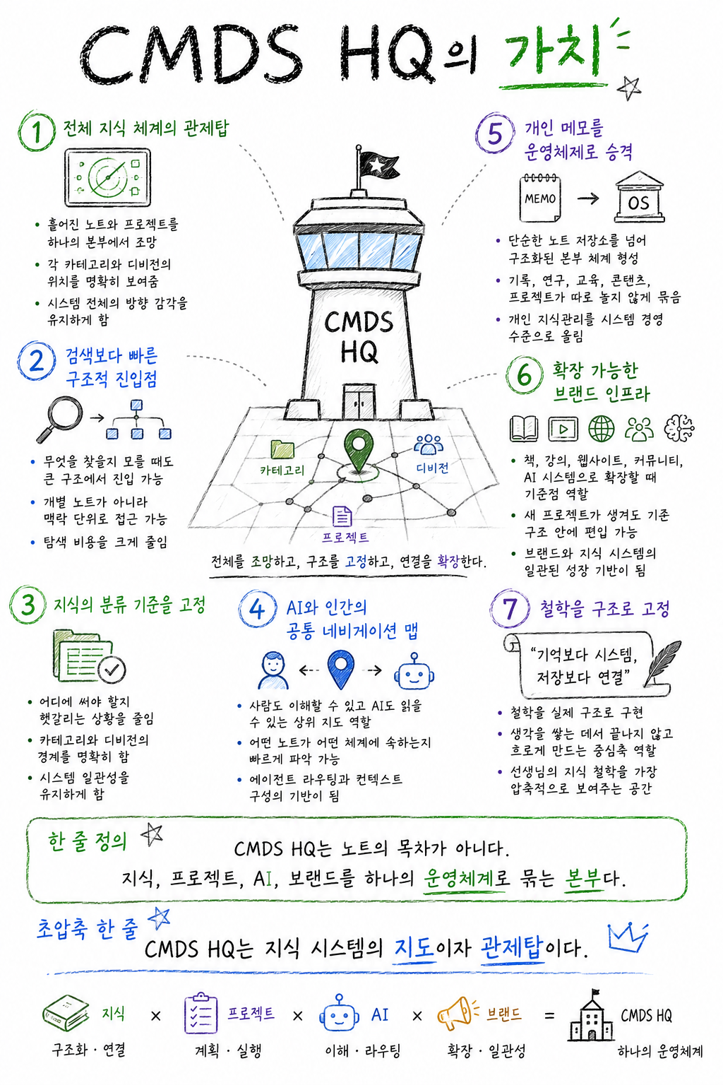
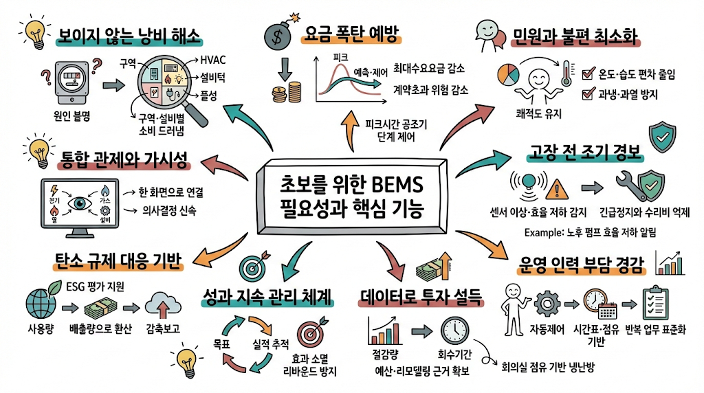
1-1. 스케치노트 시각 문법 4대 핵심 규칙
classDiagram
    class SketchnoteGrammar {
        +Canvas: Matte off-white whiteboard with subtle eraser smudges
        +PrimaryStroke: Black chisel-tip felt whiteboard marker
        +AccentColors: Highlighter Yellow, Soft Cyan, Vibrant Coral
        +Structure: 3-column comparative cards or sequential comic panels
        +Annotations: Dotted arrows, speech bubbles, sticky note pads
}- 캔버스 표면(Whiteboard Canvas):
- 번쩍이는 형광등 반사가 없는 매트한 오프화이트 화이트보드.
- 지우개로 살짝 지운 듯한 자연스러운 마커 지움 자국(Subtle dry-erase marker smudges)이 아날로그 감성을 배가시킵니다.
- 선화의 필압(Line Weight):
- 납작한 끌 팁(Chisel tip) 마커로 그은 듯한 자연스러운 굵기 변화와 손떨림.
- 형광펜 악센트(Highlighter Accents):
- 전체 캔버스는 검은색 마커가 지배하되, 핵심 키워드와 승리 옵션에만 형광 노랑(#FFF500) 또는 민트 블루(#00F0FF) 하이라이트를 칠해 시선을 유도합니다.
- 시선 유도 화살표(Guiding Connectors):
- 손으로 그린 구불구불한 점선 화살표, 별표 강조 마크, 느낌표가 정보의 흐름을 이끕니다.
2. 2단계(2-Stage) 스케치노트 생성 워크플로우
고품질 스케치노트를 생성하기 위해서는 ’텍스트 구조화’와 ’이미지 렌더링’을 분리하여 실행하는 것이 가장 안정적입니다.
2-1. [1단계] 텍스트 구조화 프롬프트 (ChatGPT / Claude 용)
[TOPIC: 예: 클라우드 서버 아키텍처 비교]에 대해 교육용 화이트보드 스케치노트를 제작하려고 합니다.
아래 형식으로 내용을 먼저 요약 정리해 주세요:
1. 메인 타이틀 (손글씨 느낌의 위트 있는 제목)
2. 3단 비교 대상 정의: Option A (온프레미스) vs Option B (단일 클라우드) vs Option C (멀티클라우드)
3. 각 대상별 핵심 특징 3가지와 상징 아이콘 묘사
4. 최종 승자(추천안) 선정 및 형광펜 강조 카피
2-2. [2단계] 이미지 생성 마스터 프롬프트 (Midjourney / FLUX 용)
A professional educational whiteboard sketchnote infographic comparing [TOPIC] in a clear 3-column layout. The canvas is a realistic clean off-white whiteboard with faint dry-erase marker textures.

All graphics, charts, and diagrams are drawn with black chisel-tip whiteboard markers with lively, expressive hand-drawn lines.

Left Column: Option A with simple doodle icons and negative red marker cross marks.
Center Column: Option B with neutral blue marker annotations.
Right Column: Option C prominently highlighted with fluorescent yellow highlighter strokes, surrounded by sparkling hand-drawn stars, green checkmarks, and a cheerful cartoon lightbulb.

Dotted arrows, speech bubbles, and charming doodle illustrations guiding the viewer's eye across the board. Crisp, organized, legible graphic recording style, Scandinavian educational poster aesthetic --ar 16:9 --style raw --v 6.1
3. 즉시 복사 가능한 실전 생성 프롬프트 2종
3-1. [케이스 1] 주니어 vs 시니어 개발자의 문제 해결 방식 3단 비교
A charming educational whiteboard sketchnote infographic comparing "Junior vs Mid-level vs Senior Developer Problem-Solving Mindsets" in a 3-column comic layout. Drawn with authentic black dry-erase markers on a clean white board. Column 1 (Junior): Frantic tangled scribbles, error codes, and a doodle of a stressed cartoon figure with question marks. Column 2 (Mid-level): Stack of orderly documentation books and systematic flowcharts. Column 3 (Senior): Relaxed cartoon figure sipping coffee, pointing to a simple 3-step master plan glowing with yellow highlighter accents and green checkmarks. Engaging sketchnote recording, warm handwritten tech blog visual --ar 16:9 --v 6.13-2. [케이스 2] 3대 생성형 AI 모델(Claude vs ChatGPT vs Gemini) 스케치노트
An ultra-clear tech comparison sketchnote on a whiteboard analyzing Three Leading AI Models in three distinct sketched panels. Hand-drawn with bold marker strokes and colorful highlighter accents (teal, purple, orange). Left: Claude analyzed as an articulate writer with parchment doodles. Center: ChatGPT analyzed as an all-round polymath with Swiss army knife sketches. Right: Gemini analyzed as a lightning-fast multimodal speedster with lightning bolts and camera lens drawings. Engaging visual hierarchy, charming tech doodles, boardroom presentation quality --ar 16:9 --v 6.14. 실무 교육 및 소셜 미디어 활용 팁
- 사내 교육 및 기술 문서 위키(Confluence) 탑재:
- 이 스타일은 신입 사원 온보딩 문서나 기술 위키에 삽입했을 때 완독률을 4배 이상 높여줍니다.
- 핸드라이팅 폰트와의 결합:
- AI 생성 이미지의 빈 칠판 공간에 ‘배달의민족 주아체’나 ‘나눔손글씨’ 같은 친근한 손글씨 웹폰트를 얹으면 완벽한 한국어 로컬라이징 스케치노트가 완성됩니다.